RAZDOW.DESIGN

Thaddeus Razdow

Senior Designer · Schneider Electric · Boston

I'm a designer drawn to projects that require creative expression and unconventional thinking. I like building things, both physically and imaginatively. I'm equally as inspired by science and futurism as much as by art and abstraction, and I aim to channel these influences in my work.


Graphic Design

Identity systems, campaign work, editorial and print.

Mandrel

2011 · personal

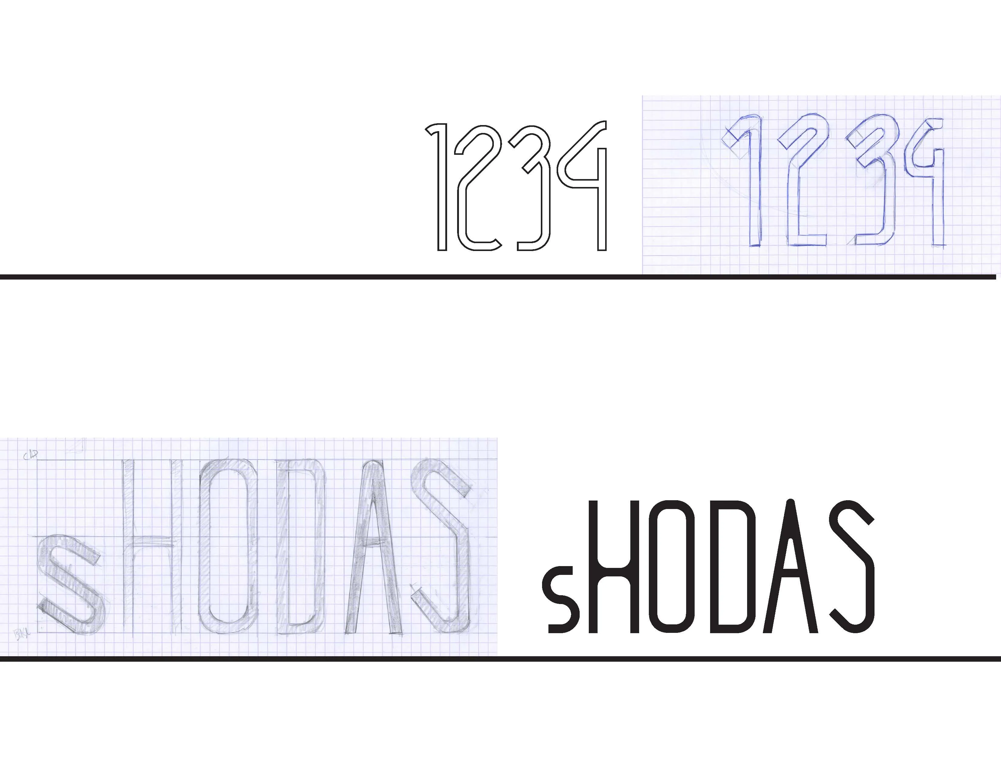
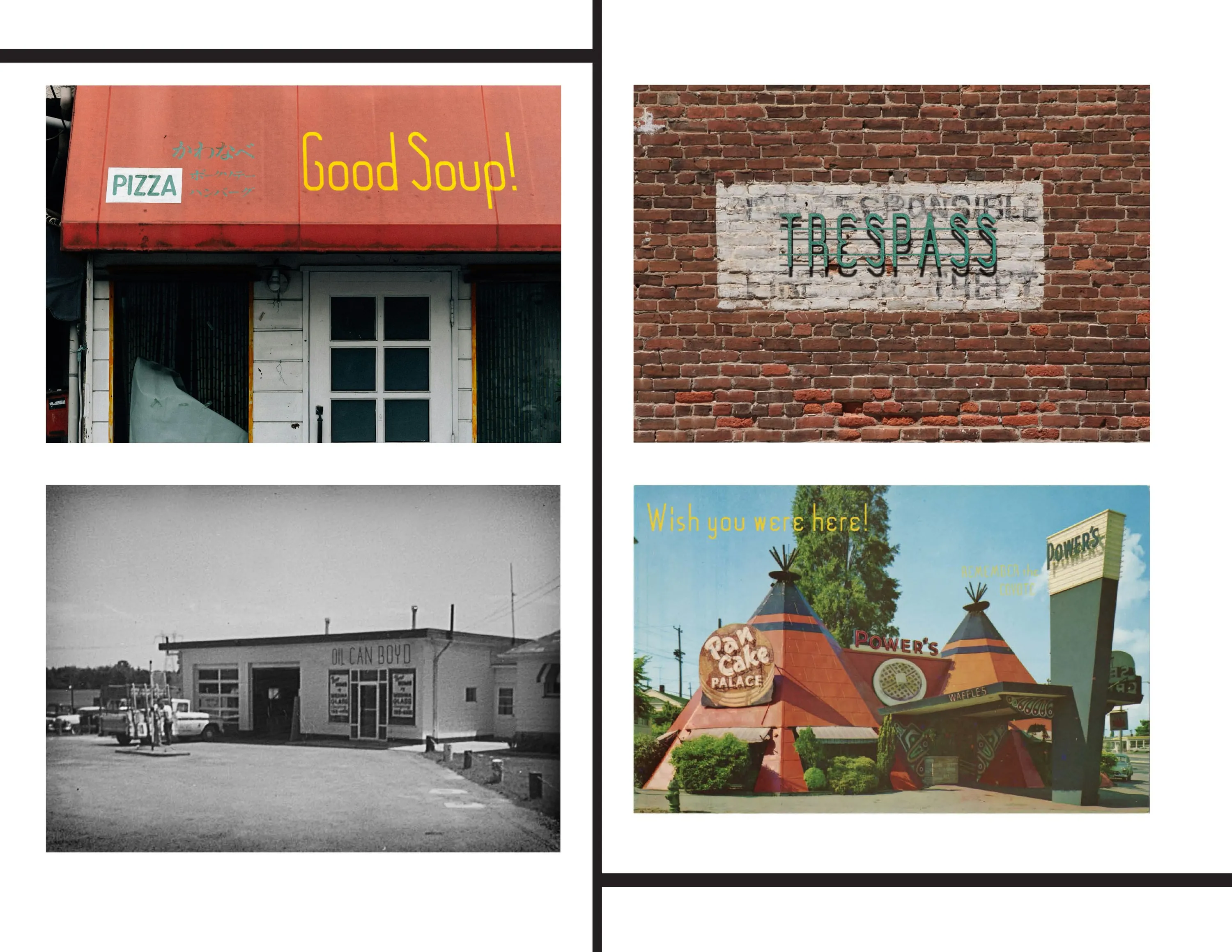
It was a kind of amalgam of my interests in austere modernist design, and industrial forms.

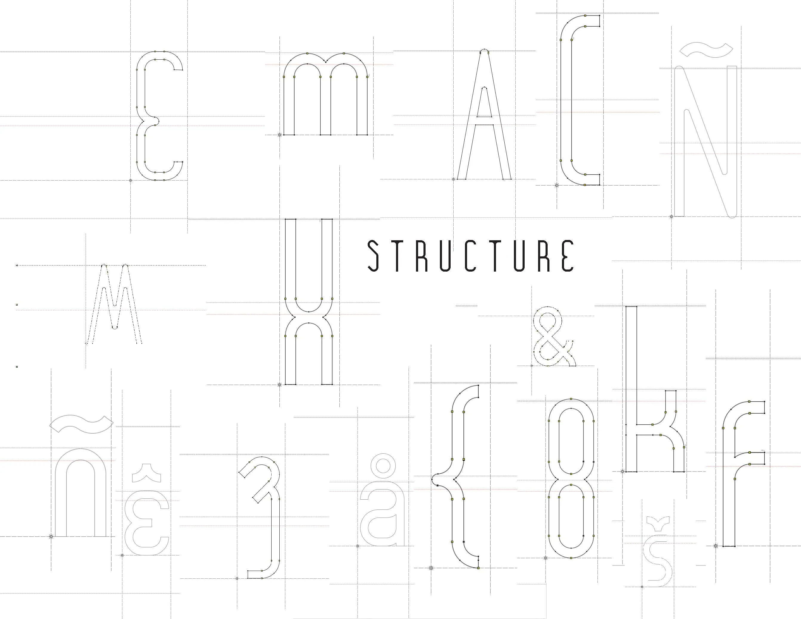
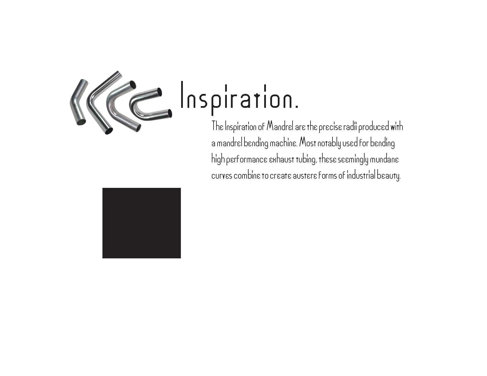
A mandrel is a support that sits inside a tube while it’s being bent, so the wall can’t wrinkle or collapse through the curve. It’s how you get clean radii in exhaust tubing which improves flow characteristics.

So the rule came before the letters: one radius, one line weight. Every curve is a fraction of the same circle, and every stroke is the same width. I started with , then rebuilt everything as vectors.

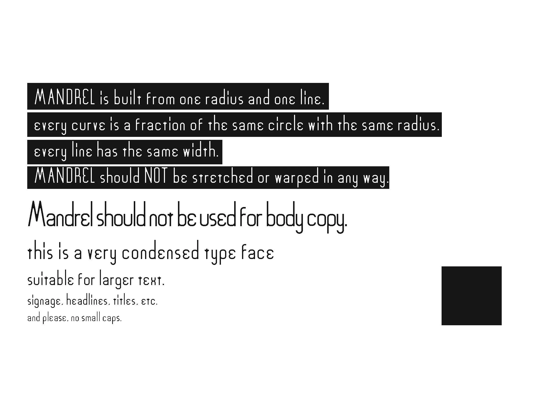
MANDREL IS BUILT FROM ONE RADIUS AND ONE LINE

A rule that strict makes a lot of the decisions for you. Some letters proved more difficult to construct than others. But what emerged had a kind of industrial beauty that I’m really fond of. Some of the characters are unusual and really stand out, which gives the typeface a striking quality.

I created a sort-of abstract spec book, with few hard rules. More of a showcase of the mood I felt the letterforms evoked. However with just one weight, this rather condensed font is most appropriate as a display font, and doesn’t read well as body copy.

SIGNAGE, HEADLINES, TITLES
and please, no small caps.

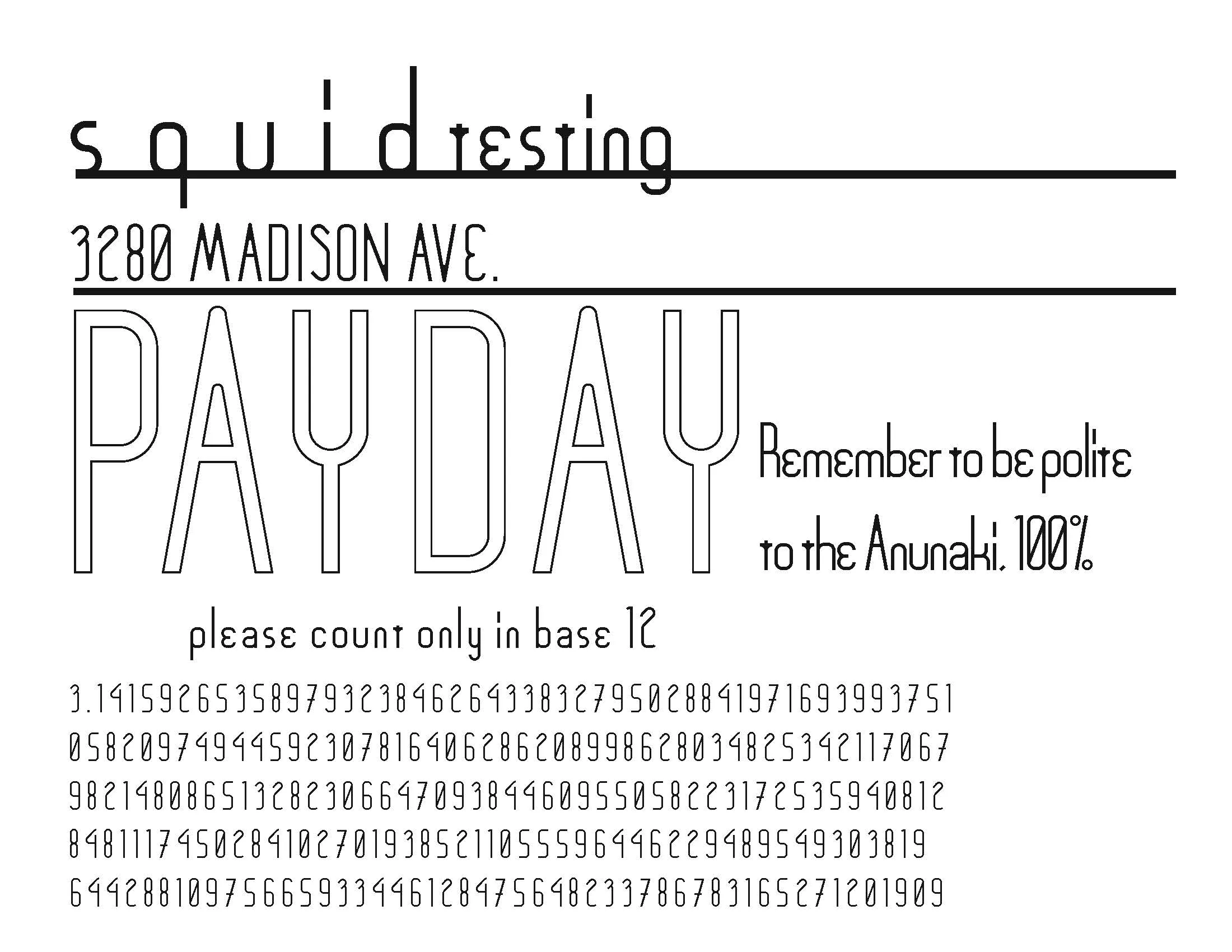
I had a little fun with the specimen page, fifty-odd digits of pi and a note about being polite to the Anunnaki. A little nod to an academic interest in alien conspiracies. Really though this was intended to display the versatility of the typeface.

The mockups are all signage, since that’s where the typeface feels most effective. But feel free to download the font yourself and see if it can be useful for your projects. I’m releasing it free for non-commercial use with attribution.
McLaren Racing

2026 · employer · Schneider Electric

InDesign · Photoshop

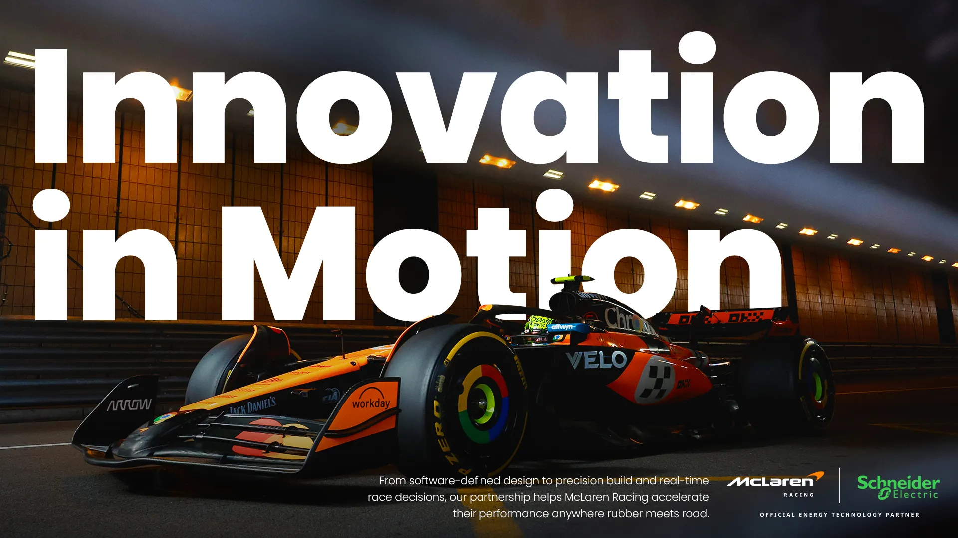
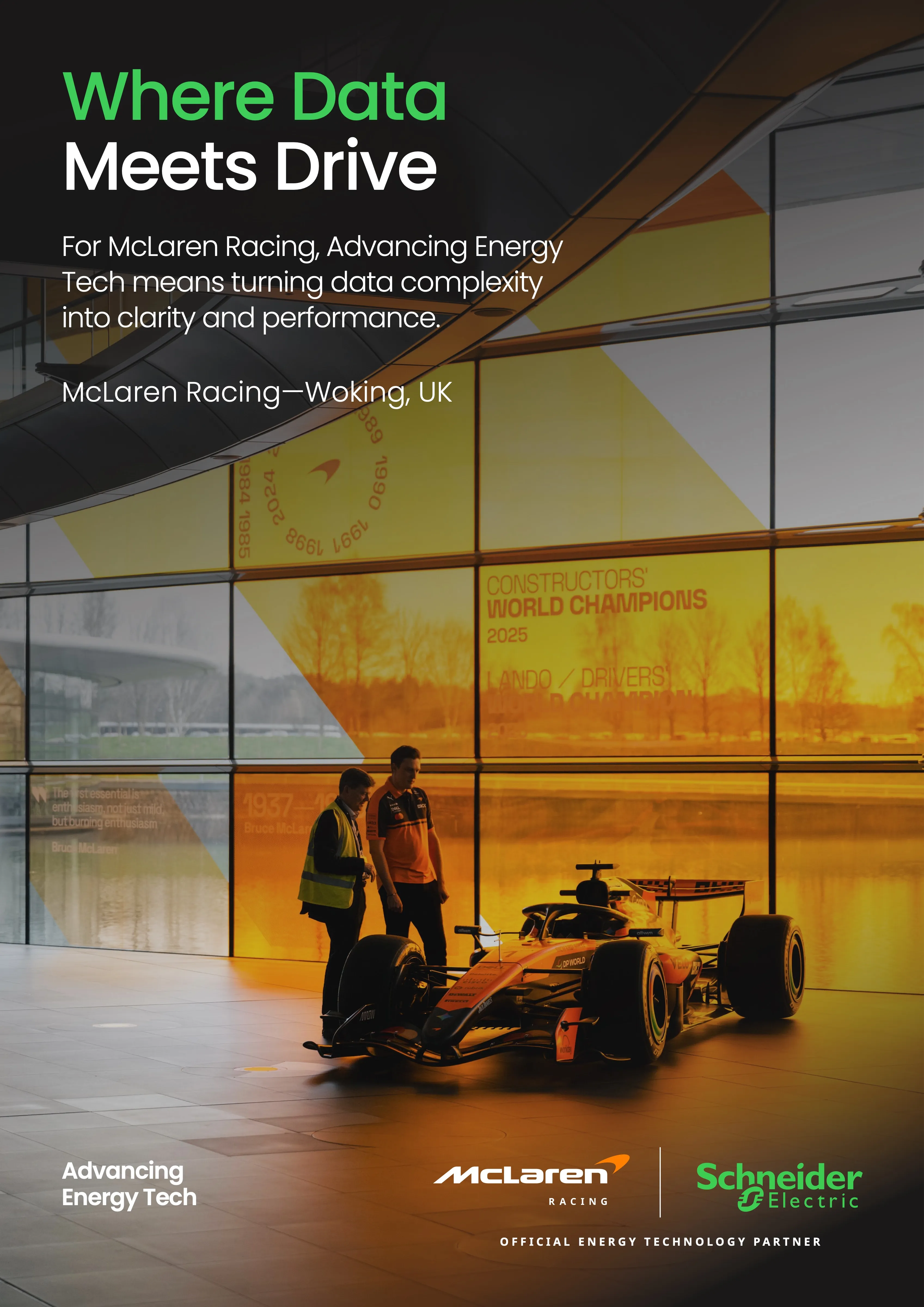
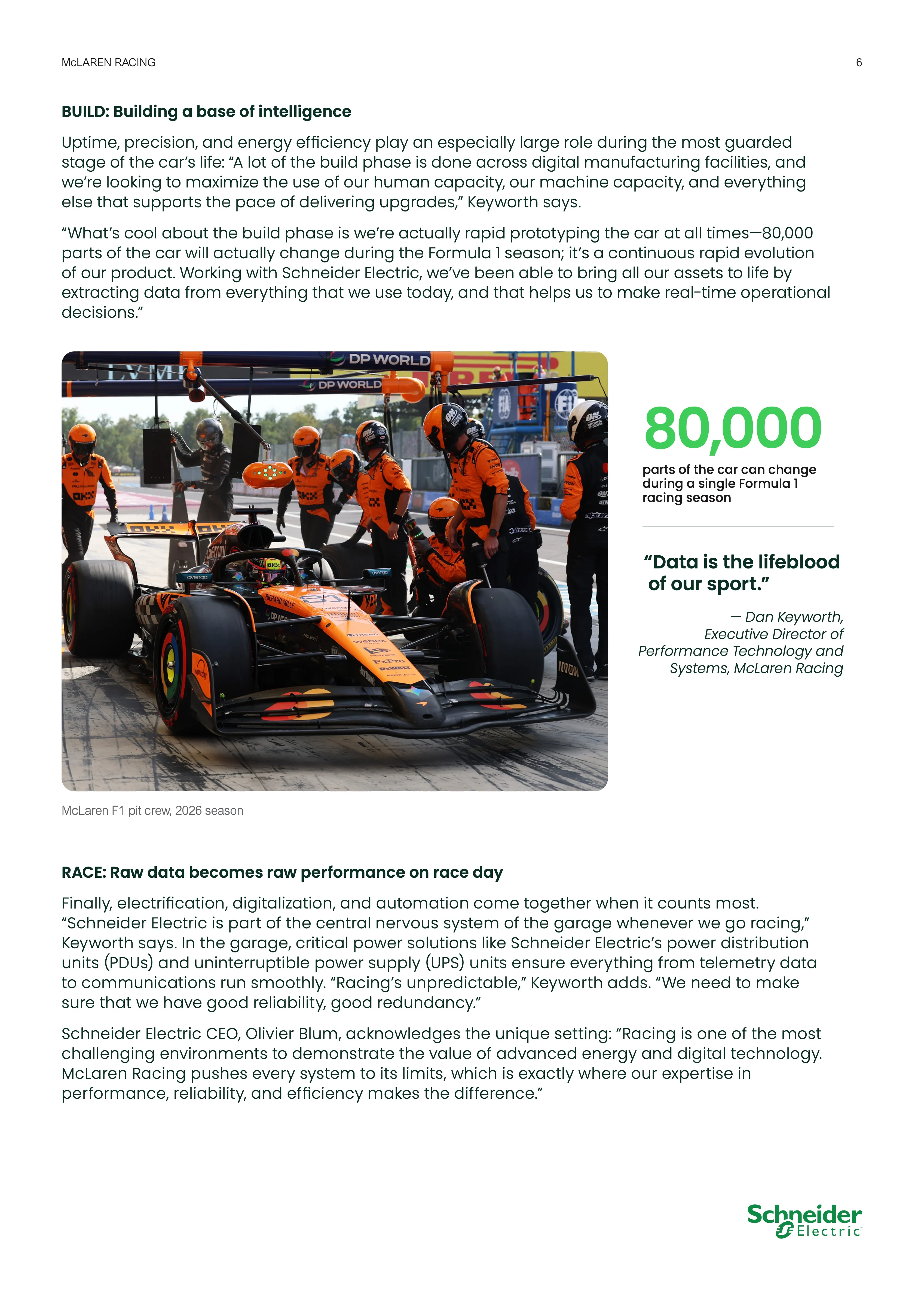
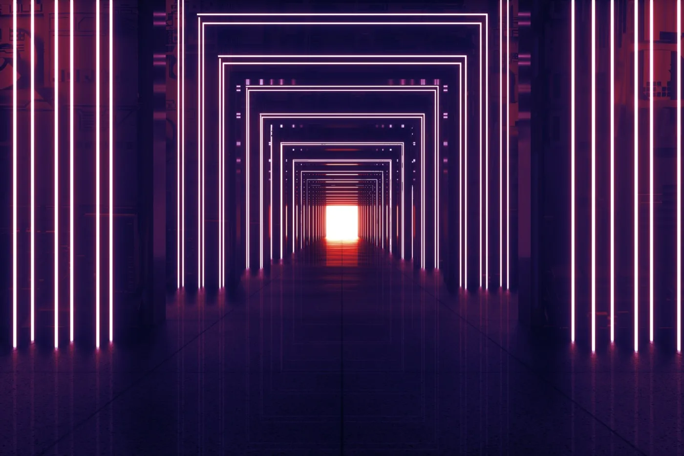
Schneider Electric became McLaren Racing’s Official Energy Technology Partner in January 2026. We power the Technology Centre at Woking, the new headquarters in Indianapolis, and the garages trackside. The brief was to make that partnership visible, which is trickier than it sounds, since our part of the story is mostly electrical equipment sitting in locked rooms.

I led photographic art direction: the look, the shot list, what had to be captured and why. I didn’t travel to Woking, so the whole thing ran remotely, with a single day of shooting on site on 9 March.

Directing remotely changes what you deliver. On set you can adjust in the moment, look at the back of the camera, ask for one more. From four thousand miles away, the direction has to be finished before anyone arrives. So I wrote it like a spec: subject list, framing, what the light should be doing, what to stay away from, and reference frames for anything I couldn’t get across in a sentence.

The bigger problem was access. McLaren’s competitive advantage lives in the parts of that building you’re not allowed to photograph, and a lot of what we could shoot still needed clearing. Whole areas were simply off limits.

So the shot list was built around what we couldn’t show: the room instead of the part, people from behind or in silhouette or as a reflection, and details close enough that the context falls away. It ended up reading as a deliberate style, and it became one, but it really did start as the only way to work.

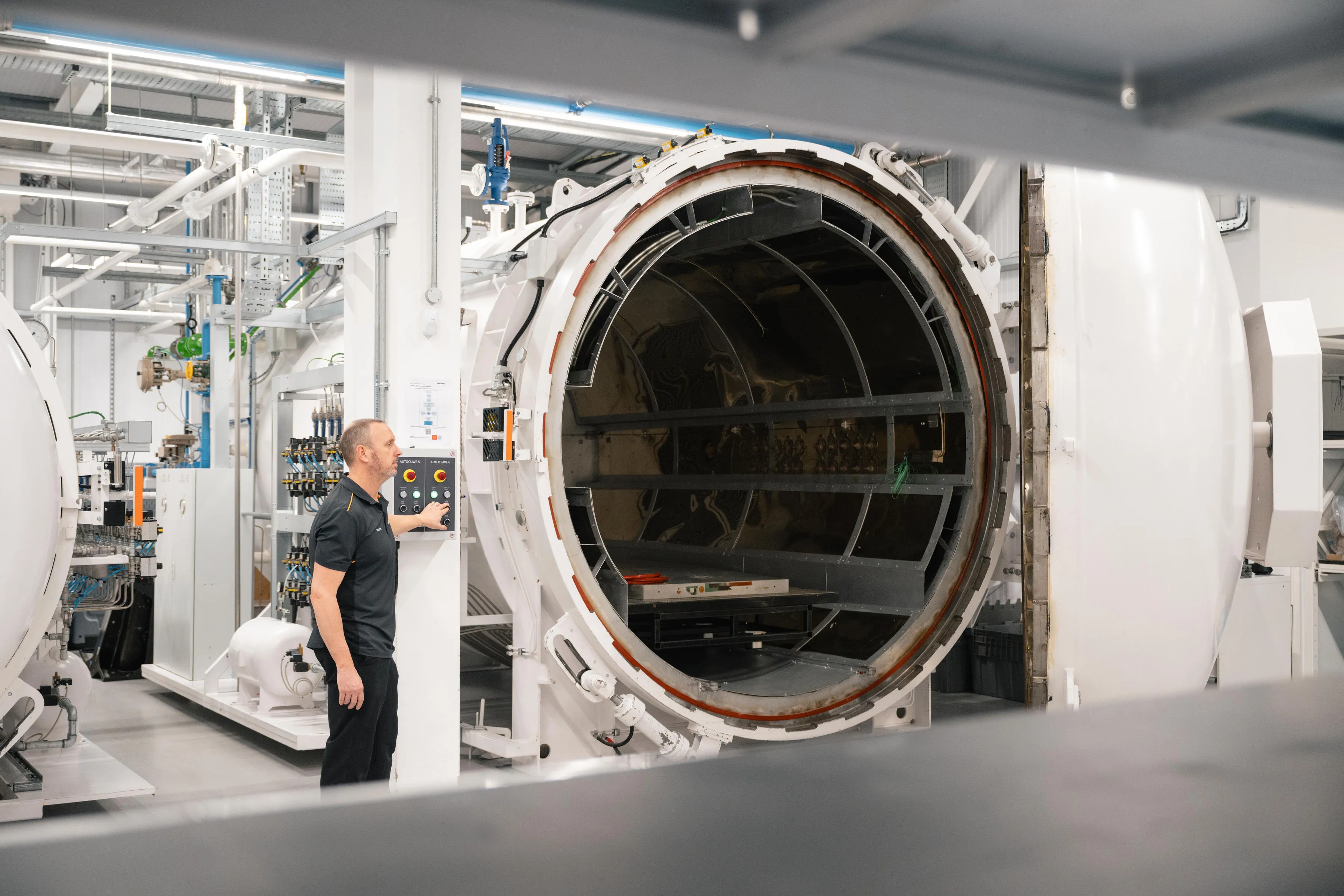
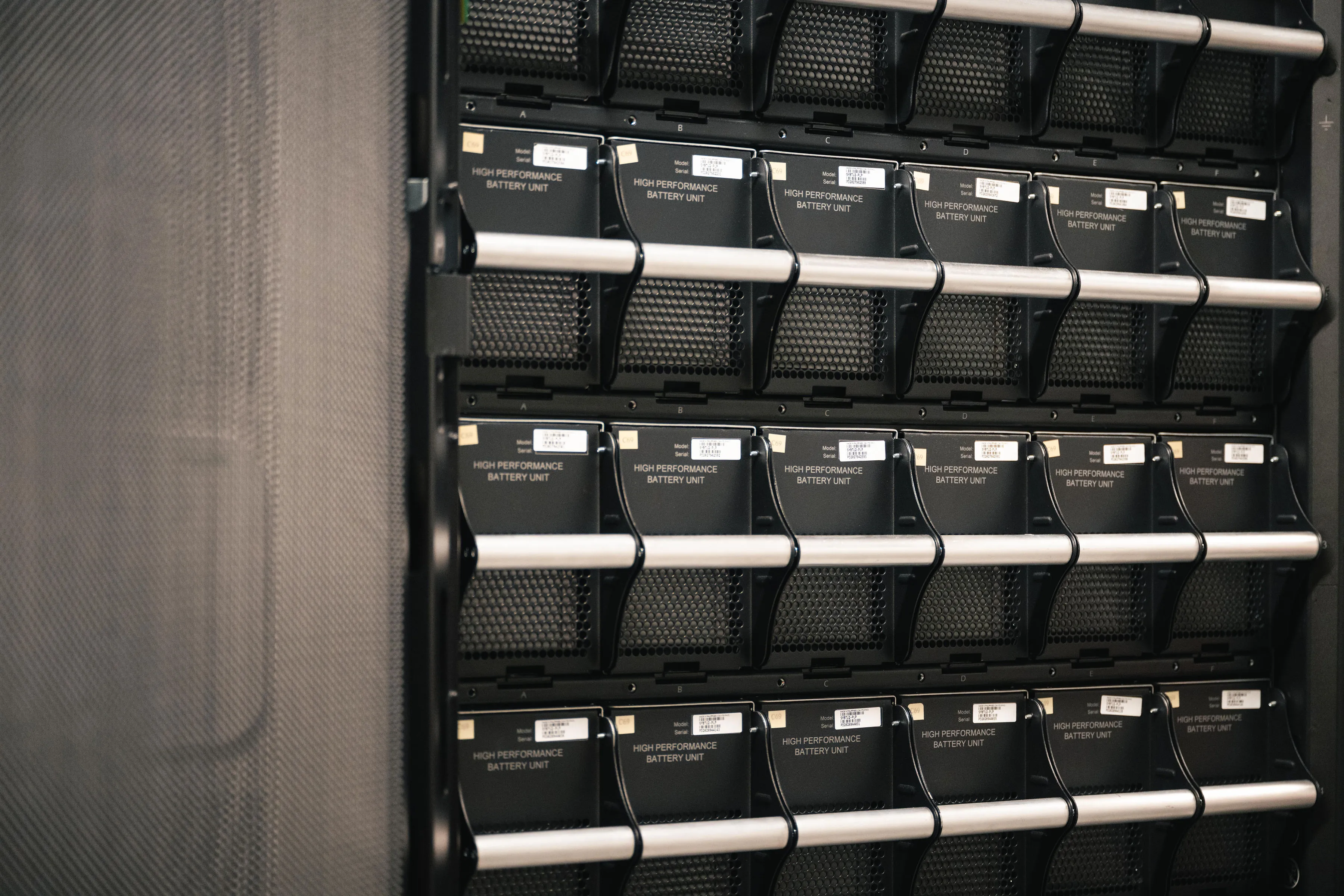
Our own equipment was the exception, since nothing in a UPS room is a secret. There we could shoot straight on. , letting the repetition carry the frame instead of fighting it.

Same with the switchgear: cabinets square to the lens, no angle, no drama. They aren’t glamorous subjects, but they’re the reason the story exists, so they had to be in there and they had to look like something.

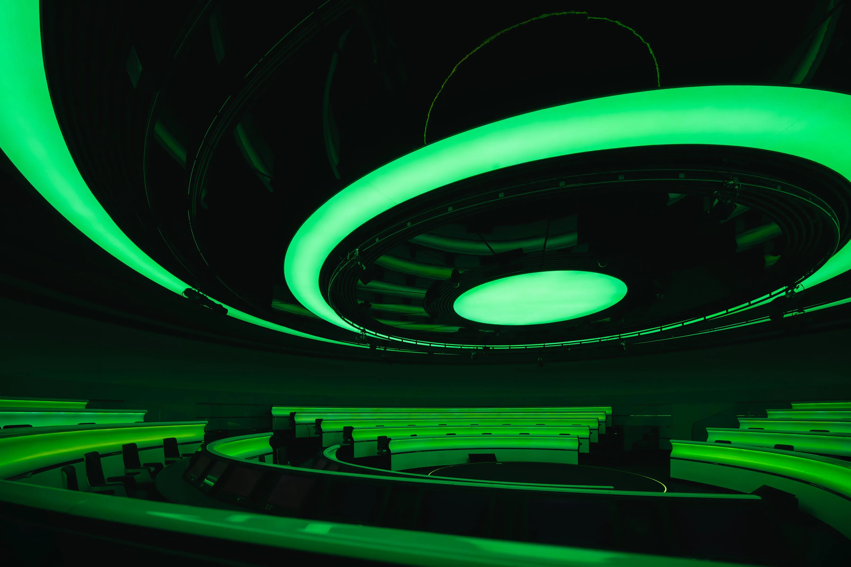
I asked for available light throughout, no strobes and no lighting kit. That was partly practical, since a lighting setup slows you down and we had one day and a long list. But mostly the building didn’t need it. The MTC lights itself: green in Mission Control, hard fluorescents in the plant rooms, that glass wall onto the lake. Strobes would have flattened all of that into a product shoot. The direction was muted color, deep blacks, sharp highlights, shooting wide open at whatever ISO the room demanded.

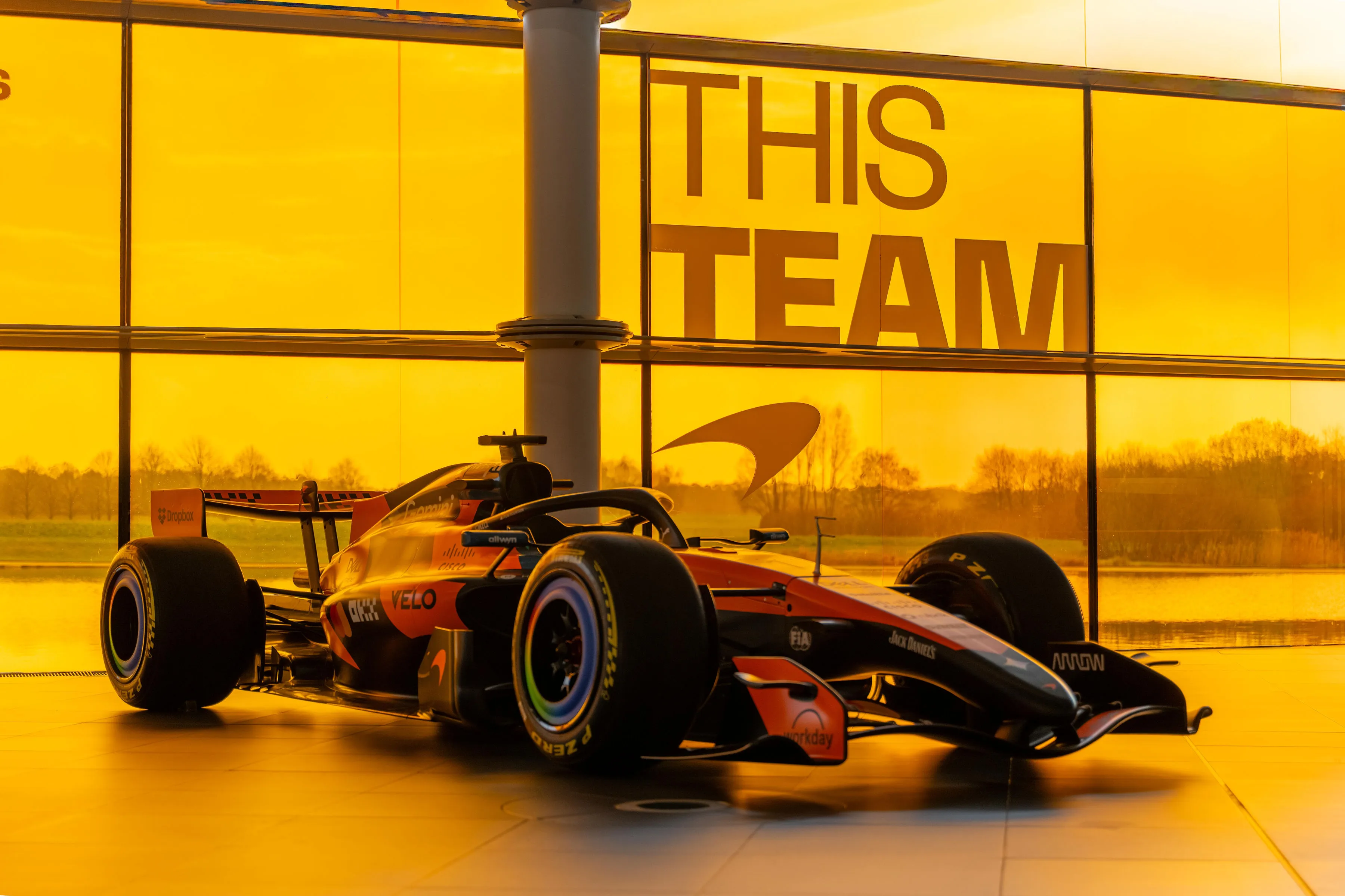
The one thing we did schedule around was . Even planned, it came down to about thirteen minutes with the car in position.
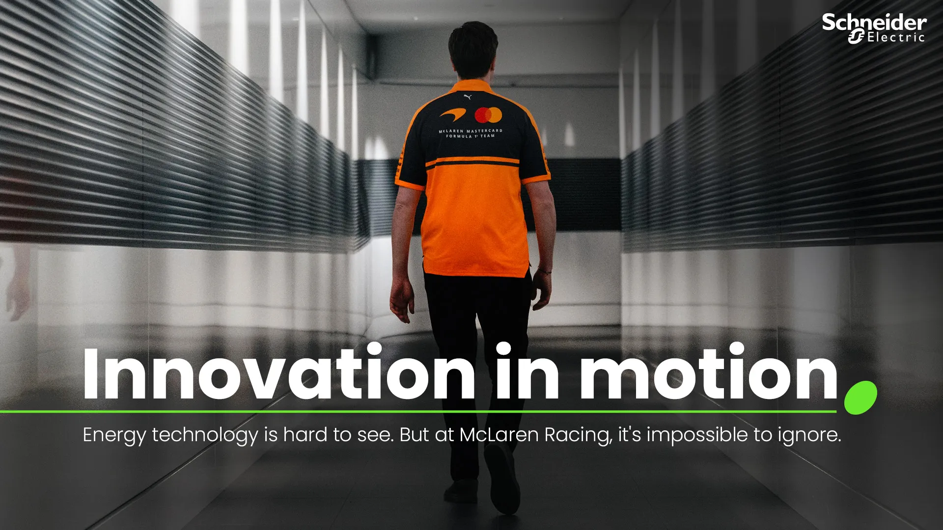
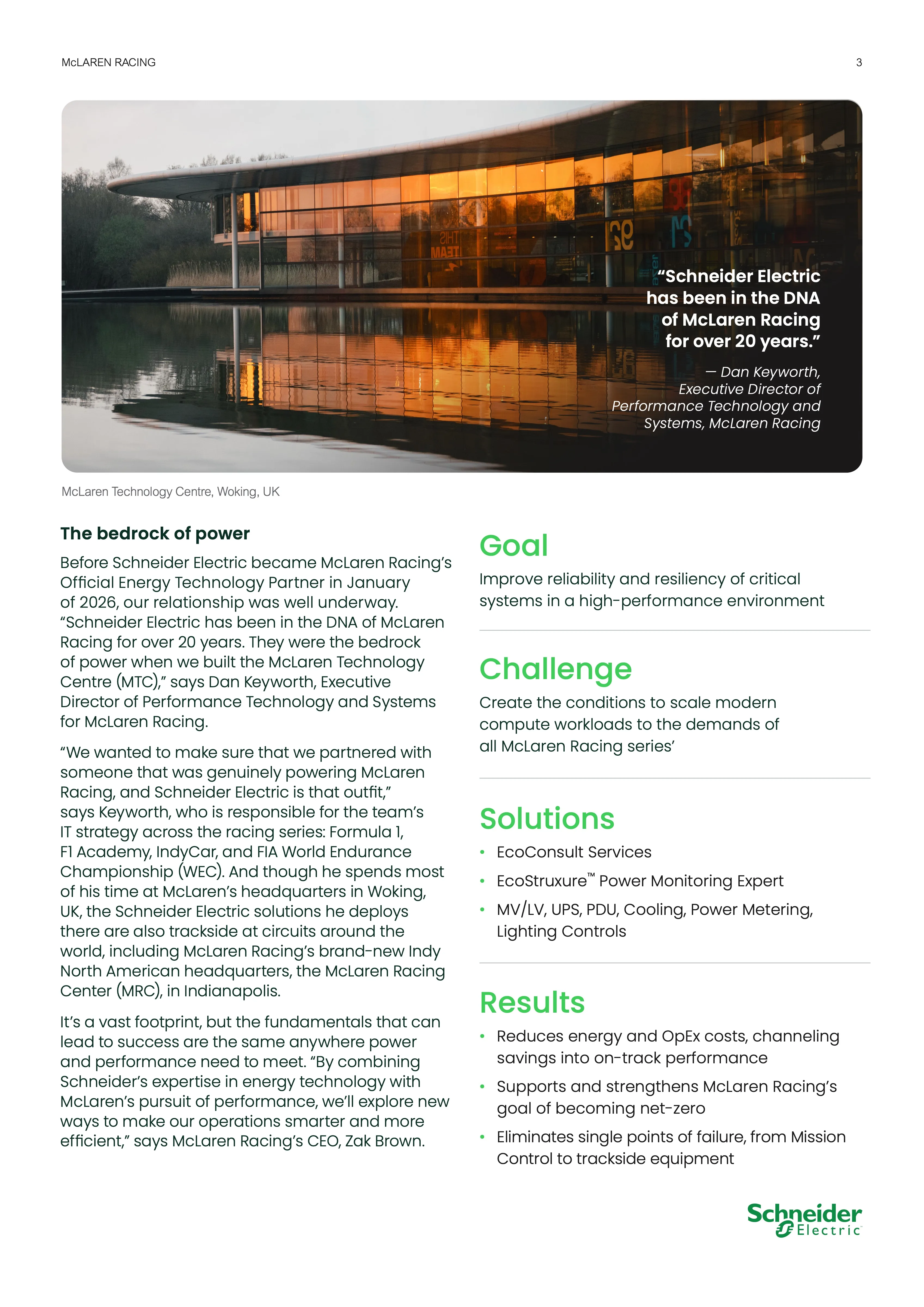
The output was a ten-page case study, the campaign key visual, and a set of supporting assets. I laid out the document; the copy came from elsewhere. Most of the layout work was getting the sidebar right. Goal, Challenge, Solutions and Results all have to sit against running body copy without either column taking over, and the photography had to stay large, since it’s the best thing in the document.

The Energy of Tech

2026 · employer · Schneider Electric

After Effects · Photoshop · PowerPoint

Early in 2026 I put together a primer for how our CEO’s keynote should be executed. Not the content, but the treatment: how video and motion could make an hour on stage feel like it mattered.

The device is a sentence that never finishes the same way. The Energy of Data. Of Grid. Of Earth. Of People. A rapid timelapse montage runs underneath, each cut completing the line differently, and after seventeen seconds it lands back on the open phrase. Schneider does too many things to sum up in one image, so instead of trying, the montage keeps answering the question in different ways.

The reference I built it on is Koyaanisqatsi, Reggio’s 1982 film, all timelapse and no dialogue. It’s an odd thing to bring to a corporate keynote, but that’s what made it useful. It gives you permission to hold a shot, let scale do the work, and trust an audience with something wordless.

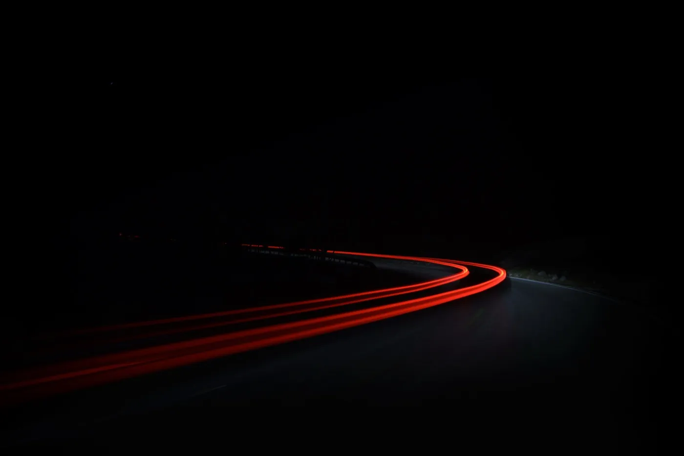
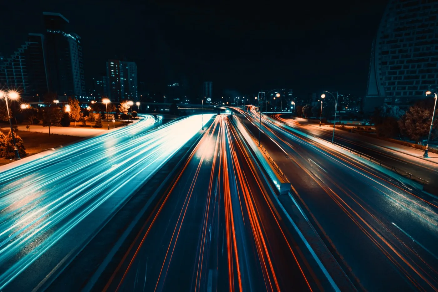
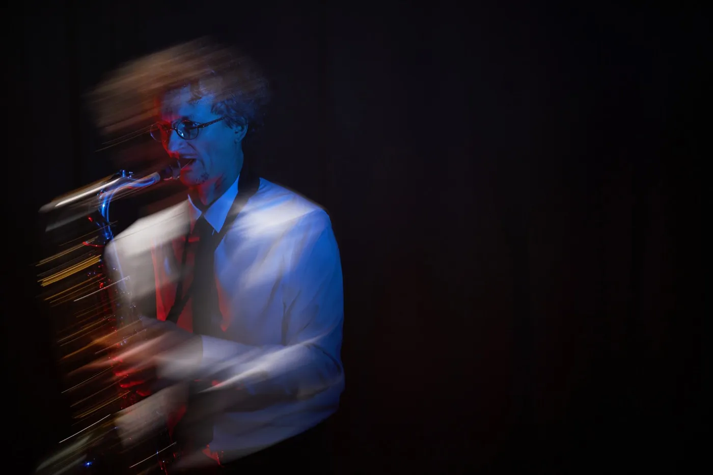
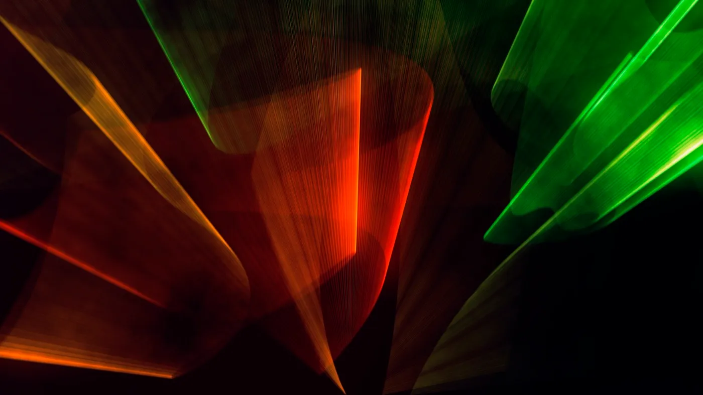
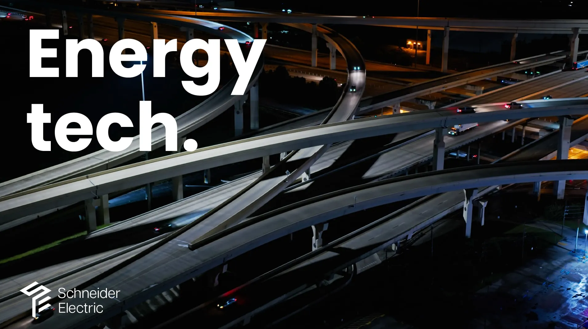
Long exposure runs through the whole treatment. Light trails on a mountain road, an interchange at night, . It’s all the same idea: energy is invisible until something holds still long enough to record it.

I also specified the music as part of the design instead of leaving it to whoever cut the video. Orchestral and electronic mixed, on one motif that builds. Philip Glass scored Koyaanisqatsi, so the film and the music are really one reference, not two.

The staging takes it the furthest. Electroluminescent wire, electronically controlled and cued against the projections, so the light-trail language steps off the screen and into the room. For the length of a cue, the graphics become part of the architecture.

Between segments the same language handles the transitions, abstract motion blur instead of a slide wipe, so the montage and the graphics read as one idea running at different speeds.

For type the direction was bold, minimal and concise, which in a keynote mostly means being disciplined about how much text makes it onto a slide.

2025 Rebrand Exploration

2025 · employer · Schneider Electric

Illustrator · Photoshop · InDesign

In 2025 our CEO and global creative director briefed the start of a year-long rebrand. This was the first pass at it, early enough that everything was on the table — including the logo.

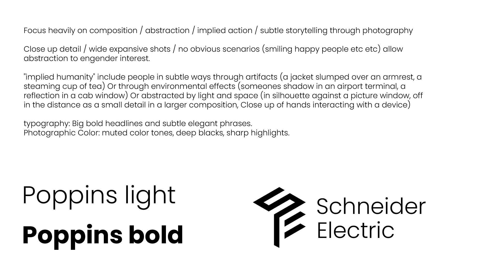
What I wanted was a bolder, more modern typographic look, and a mark that could stand on its own without the wordmark holding it up.

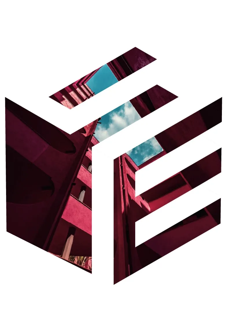
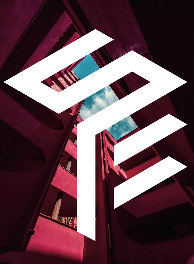
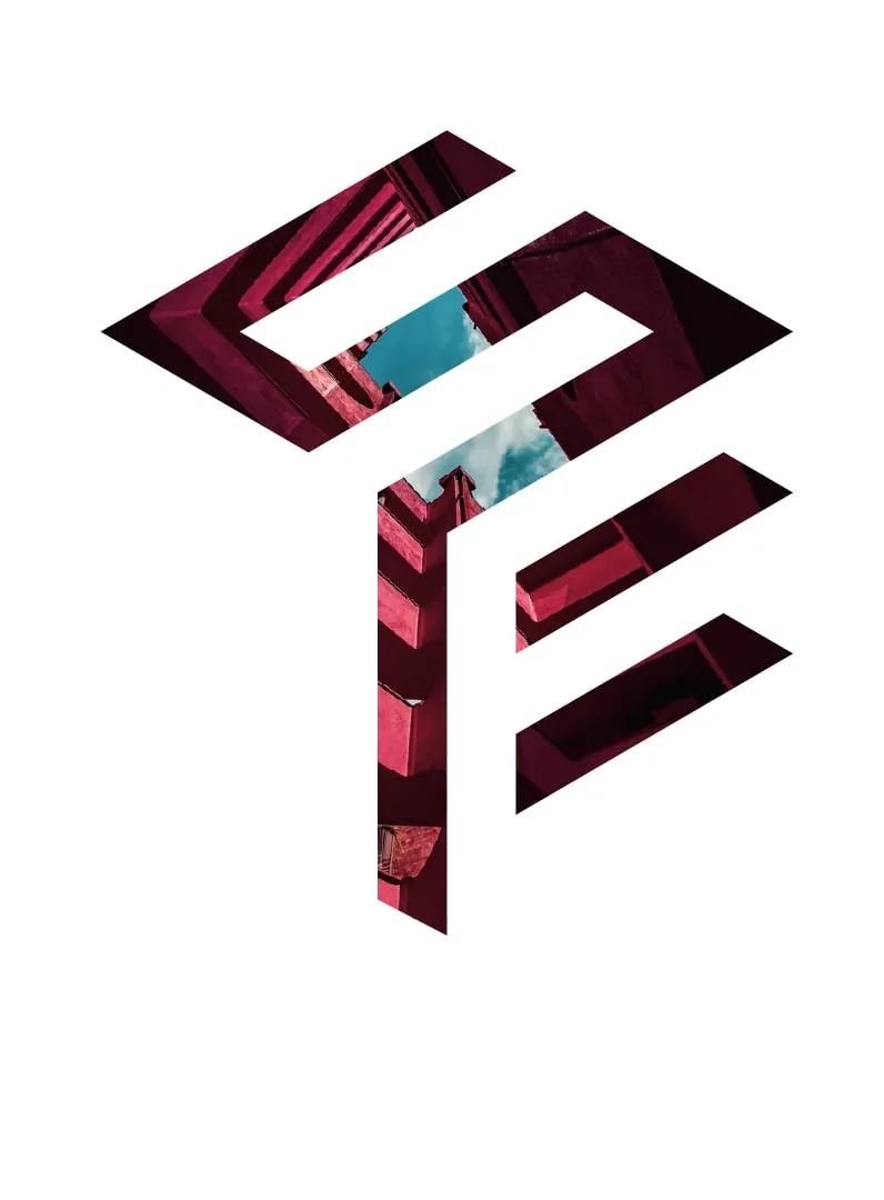
The mark is an isometric cube with the S and E cut into three of its faces. It came out of looking at what we actually make: datacenter stacks, battery banks, things that get racked and repeated. There’s a metaphor in there too. Schneider is the building block underneath modern energy management, and you never see it, whether the building is an industrial facility, a hospital, or an office tower.

Because it’s built as a volume instead of a flat drawing, it works like a container. Outlined, it’s a cube. Knocked out white, it’s a lettermark. Filled with a photograph, it becomes a frame for whatever the campaign is about that month. One geometry covers all three states, with no redrawing needed.

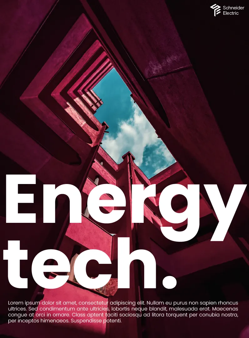
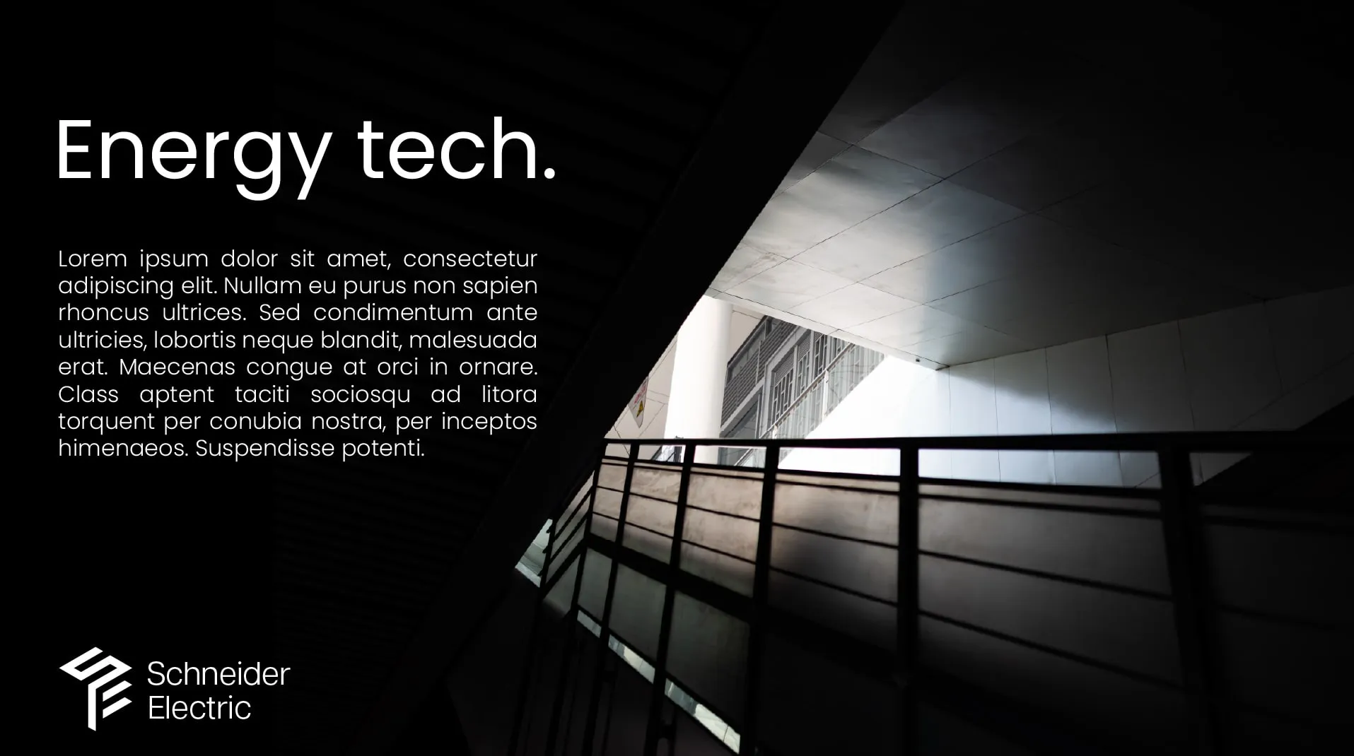
For type I went with Poppins, which is geometric, has wide apertures, and holds up set very large without getting decorative. The system was two registers and nothing in between: big bold headlines, and quieter light-weight lines underneath doing the actual explaining.

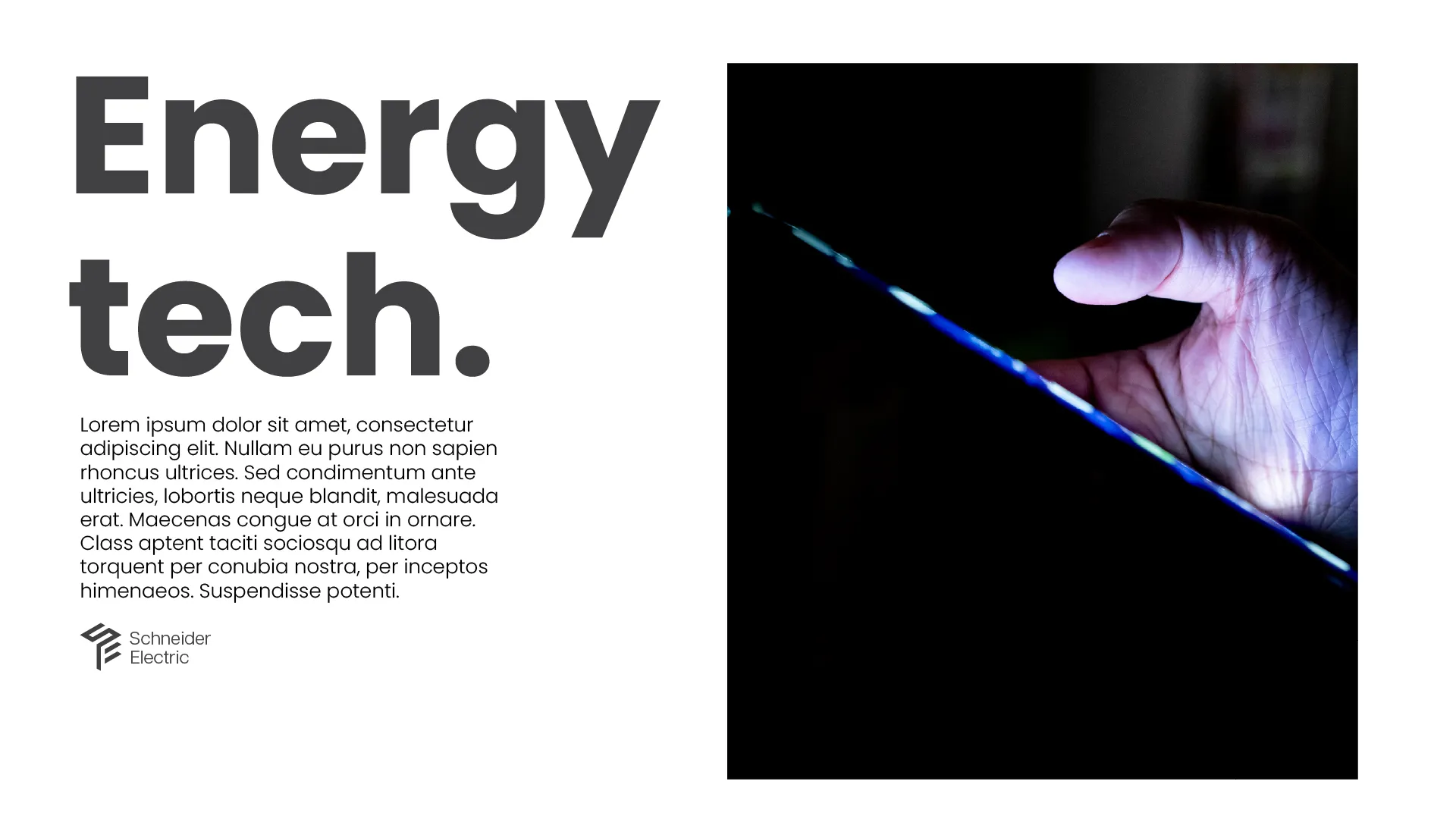
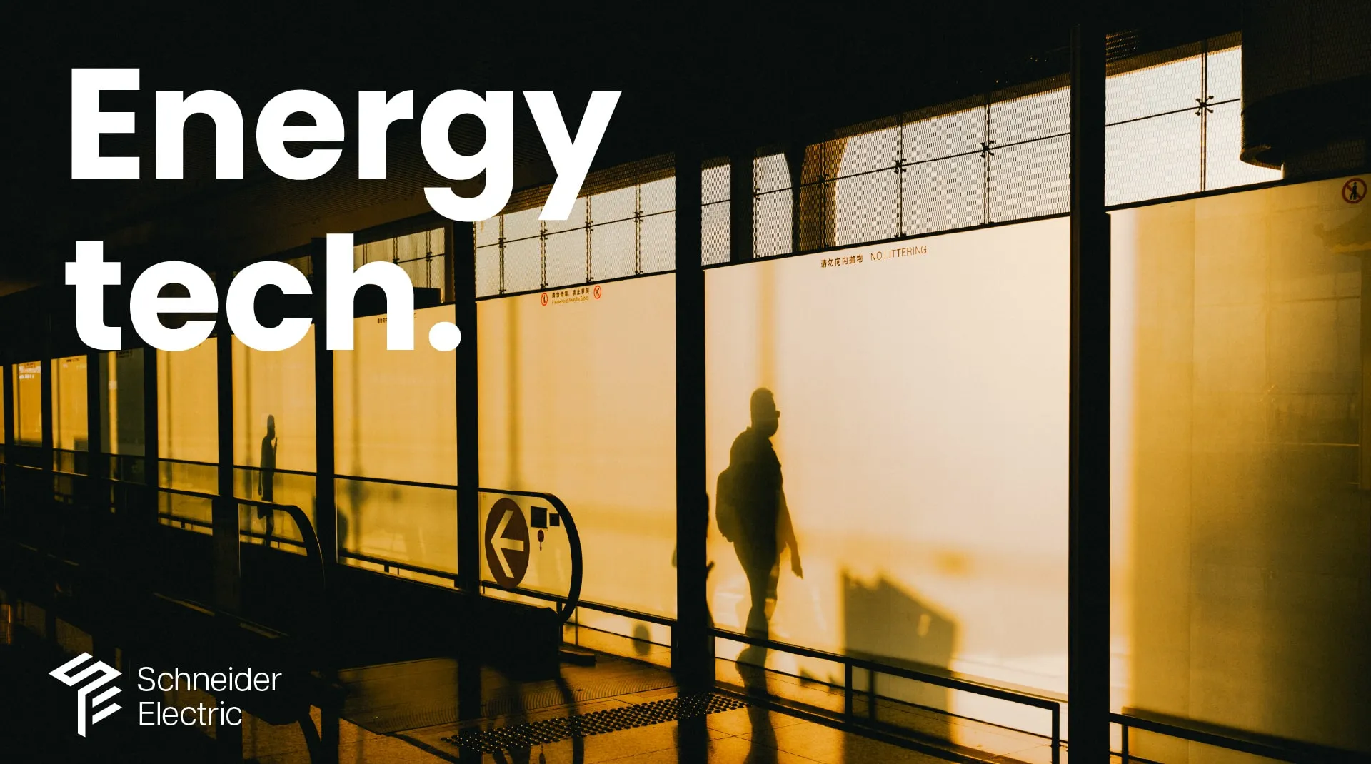
The photographic direction was the part I wrote down most carefully. Composition, abstraction, implied action. No obvious scenarios and no smiling people at workstations. Where people show up, they show up sideways: a shadow across a terminal wall, a reflection in glass, a silhouette against a window, hands up close. Muted color, deep blacks, sharp highlights.
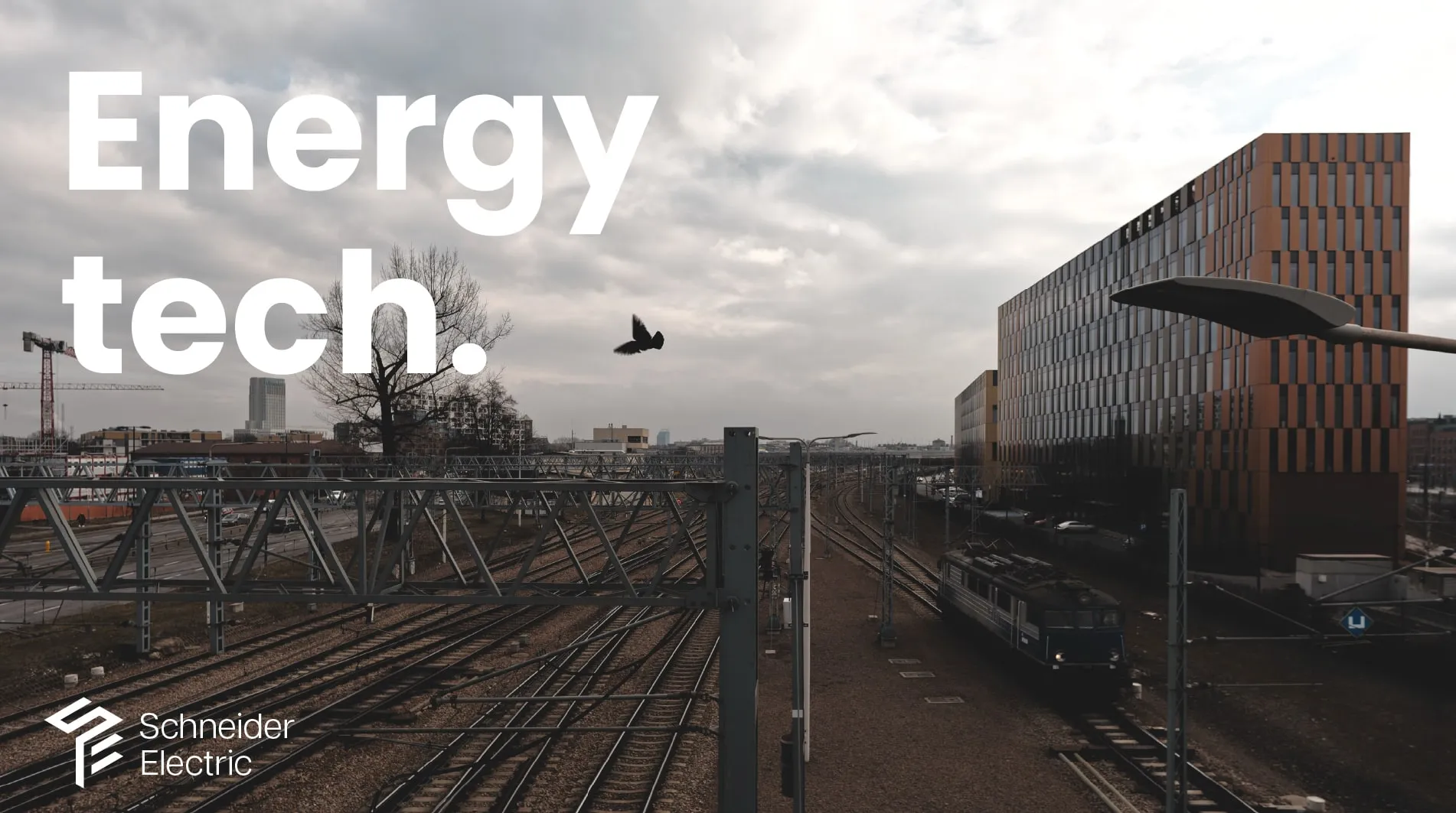
The images here are stock, picked to argue for a mood rather than to be used. I wanted to show what the brand could look like if it stopped explaining itself in pictures.

The mark stayed an exploration. The typography went further, and Poppins is now Schneider Electric’s global primary typeface. The photographic direction carried over too, and showed up again the following year on McLaren Racing.
Customer Story Campaign Evolution

2026 · employer · Schneider Electric

InDesign · Illustrator · Photoshop

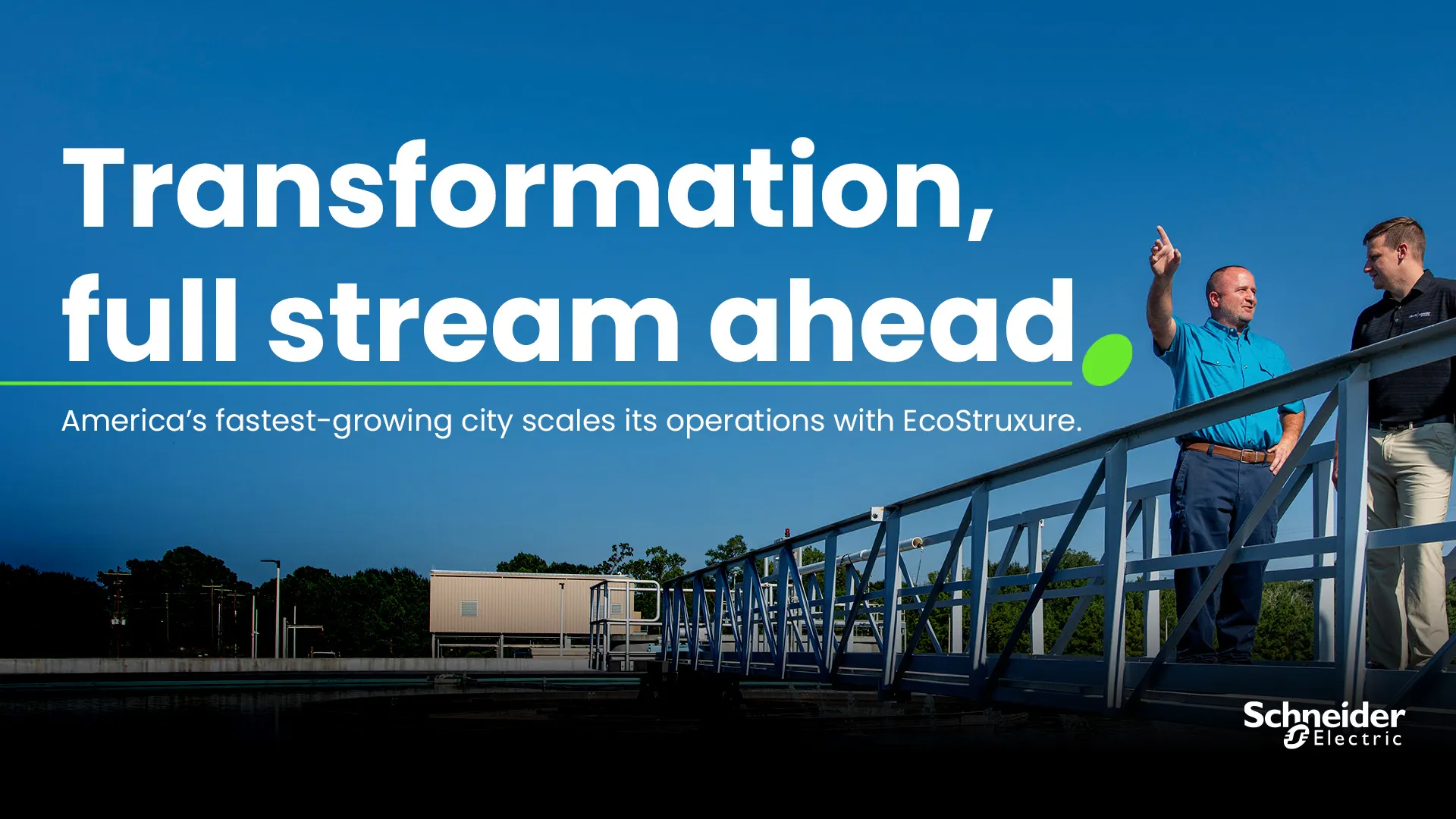
Our customer stories had drifted out of step with where the brand was heading. This was a proposal for how they should look and read going forward, an execution style built specifically for customer stories instead of whatever the nearest template happened to be.

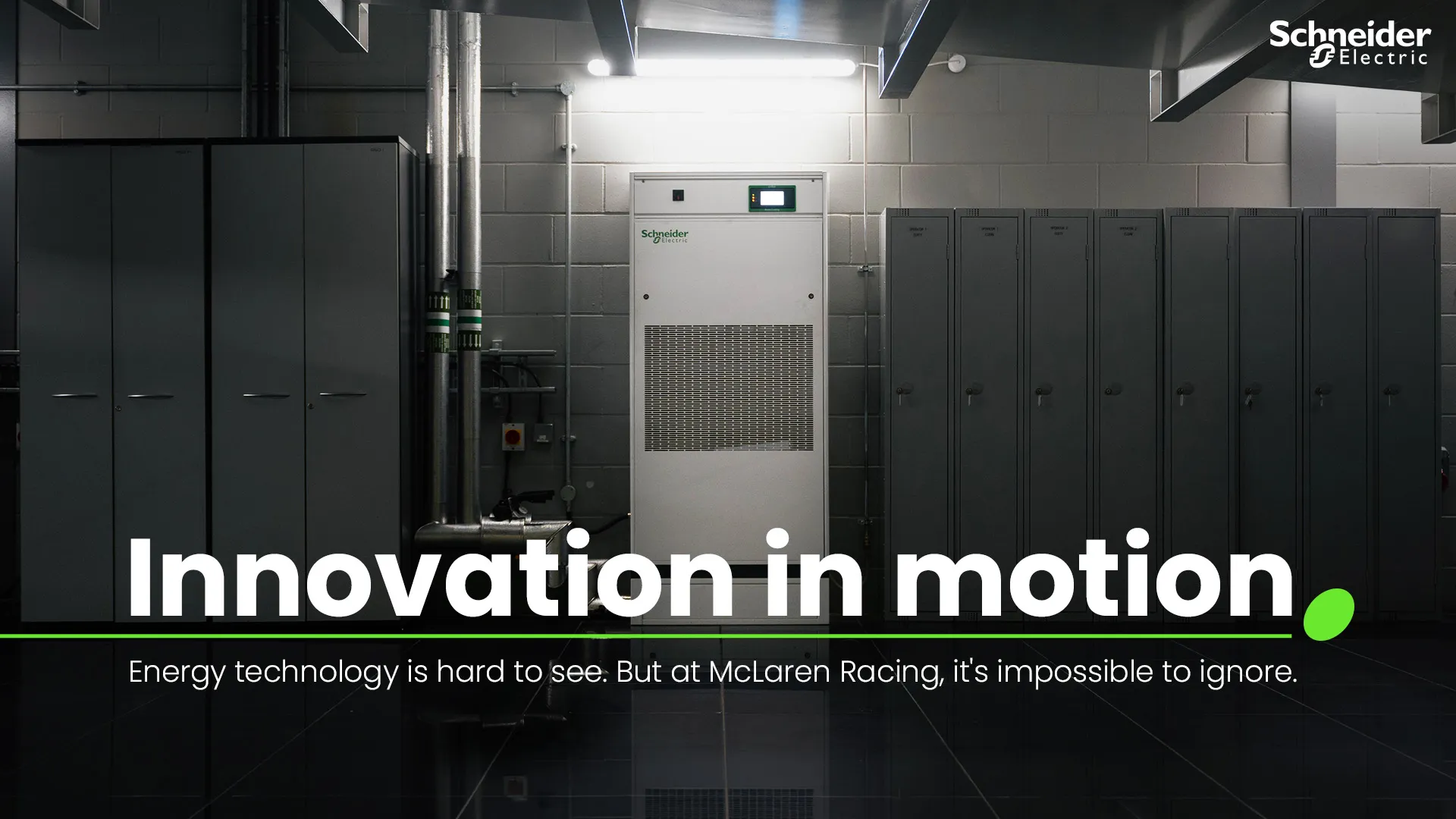
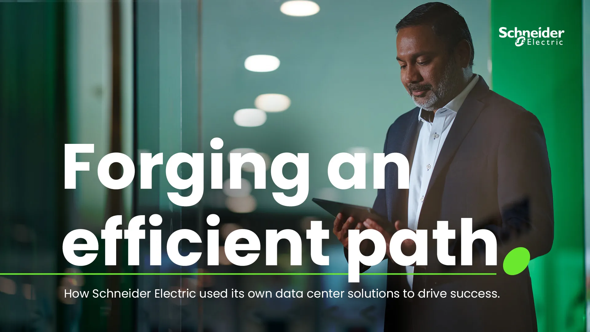
The interesting problem was the oval. Our current guidelines lean on it hard as a standalone graphic, and at that volume it starts to take over, to the point where every layout ends up being partly about the oval.

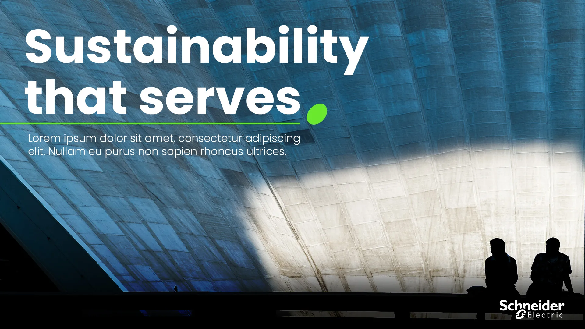
The oval isn’t going anywhere, and it shouldn’t, since it’s ours and people recognize it. So instead of arguing for less of it, I gave it a job as punctuation. It closes the headline the way a period closes a sentence, with a thin green rule running out from underneath to carry your eye down to the subhead. It’s the same element, but now it’s doing grammar instead of decoration. It reads as intentional at any size, and it stops competing with the photograph.
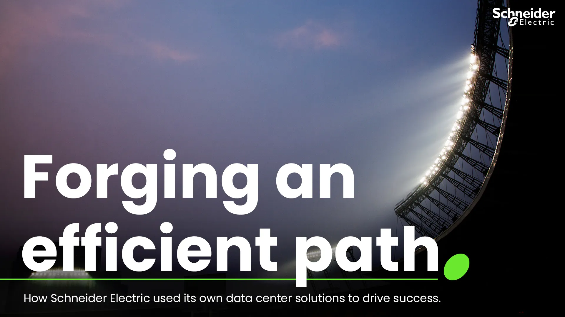
The bigger idea behind the proposal is that the storytelling should come from striking imagery and a bold headline, with everything else getting out of the way.

The rest of the work was checking that it holds up. I set , a mirrored corridor and a grey cooling unit between lockers, to make sure the lockup carries the tone on its own instead of borrowing it from the image.

Then it went across categories: product, people, architecture, on location. Fixed position, fixed relationship between headline, rule, oval and subhead. The only things that change are the crop and how much dark you have to land the type on.

This is a proposal inside an ongoing initiative, so what gets adopted remains to be seen. The headlines aren’t mine, though I worked on the tone.

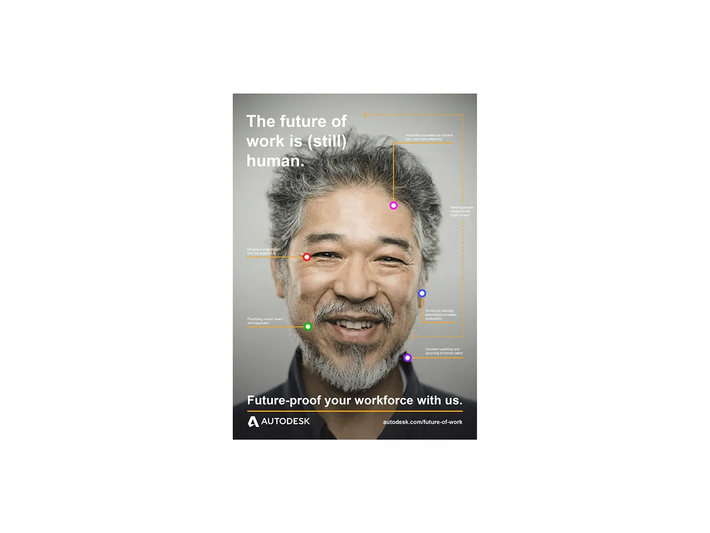
The Future of Work Is (Still) Human

2020 · client · Autodesk

Illustrator · Photoshop · InDesign

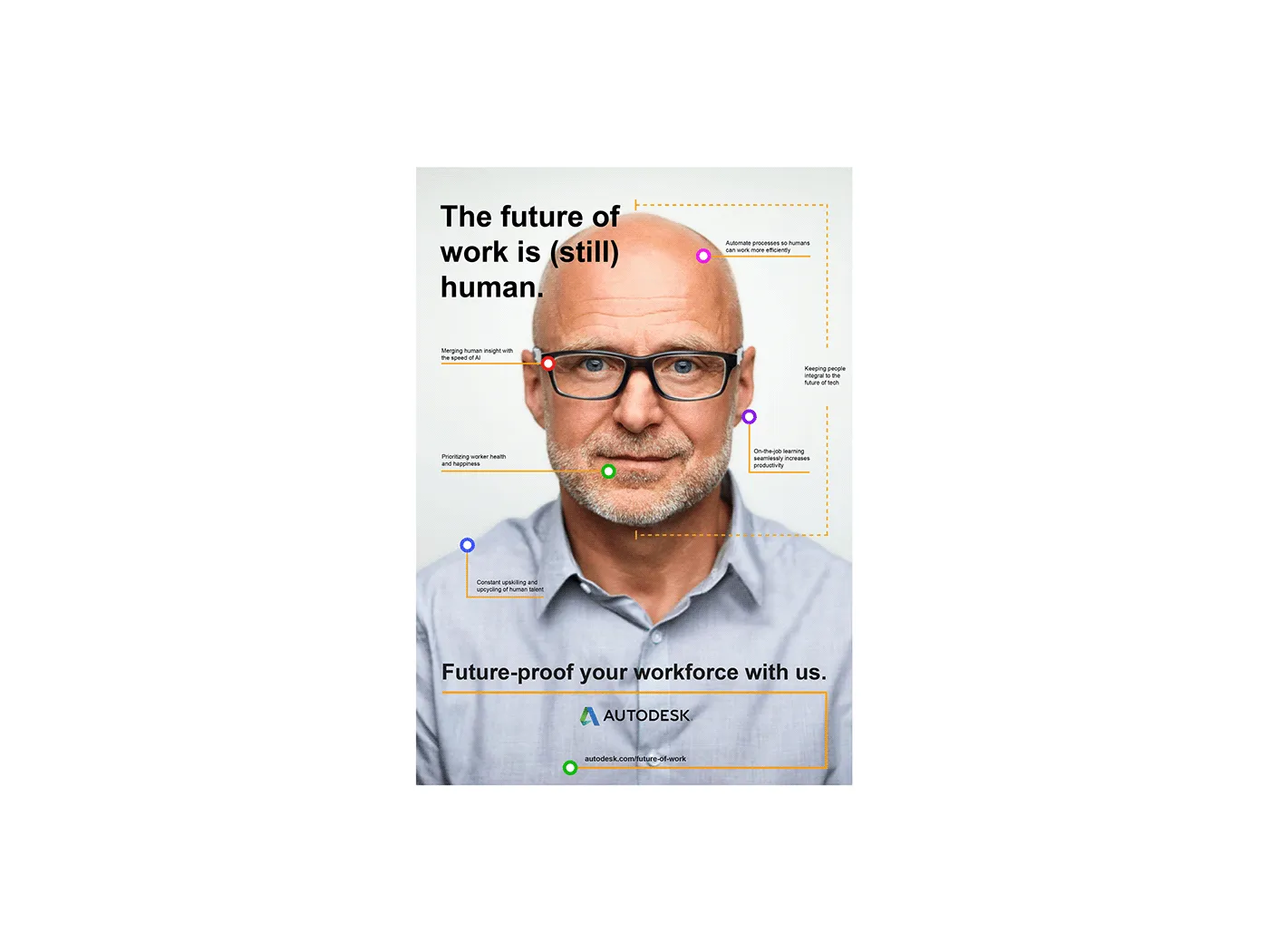
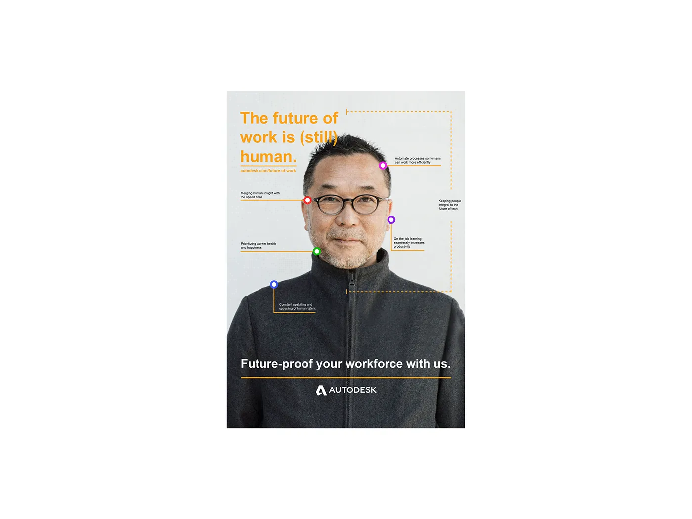
Autodesk sells software that automates work, and a good share of the people who see Autodesk advertising are quietly worried about being automated out of a job. Any campaign in this space has to deal with that somehow.

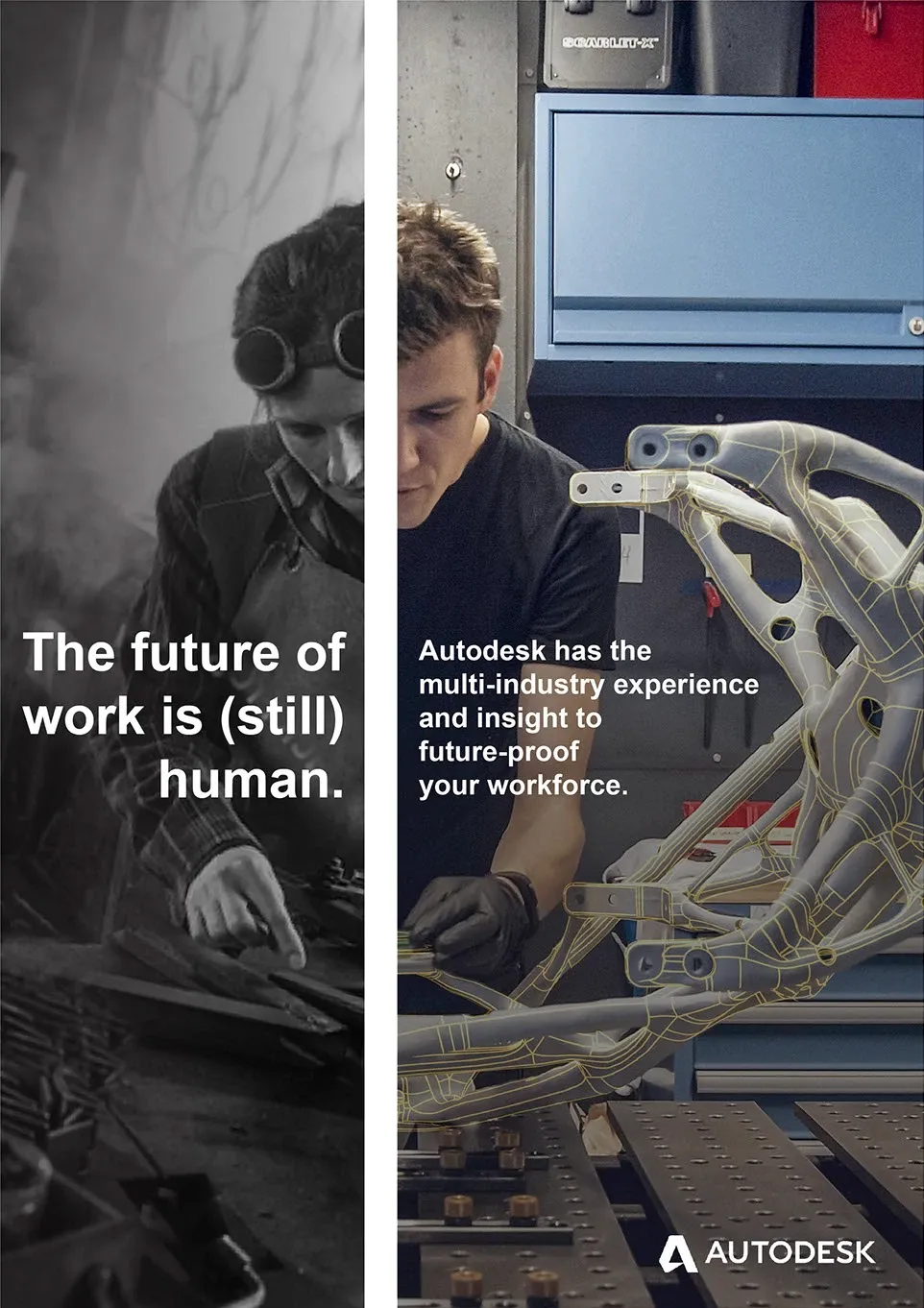
The line was “The future of work is (still) human.” The parenthesis matters. You can’t reassure somebody by pretending they weren’t worried in the first place.

Rather than argue it in copy, I annotated the person. Colored nodes sit on a portrait, with leader lines running out to short labels: merging human insight with the speed of AI, constant upskilling, prioritizing worker health. It’s the language of a technical drawing, which is Autodesk’s own visual world, just pointed at a face instead of a part. Treating the person as the thing being documented makes the argument on its own, without the copy having to spell it out.

The vertical pair does the same thing across time instead. A welder from the archive sits next to someone building a bike frame with a CAD wireframe over it. Same craft and same hands, eighty years apart, with only the tooling changed.

I came up with the concept and designed it. The photography is stock. It was concept work and it wasn’t selected, which happens.

We Don't Do

2019 · employer · Schneider Electric

InDesign · Photoshop

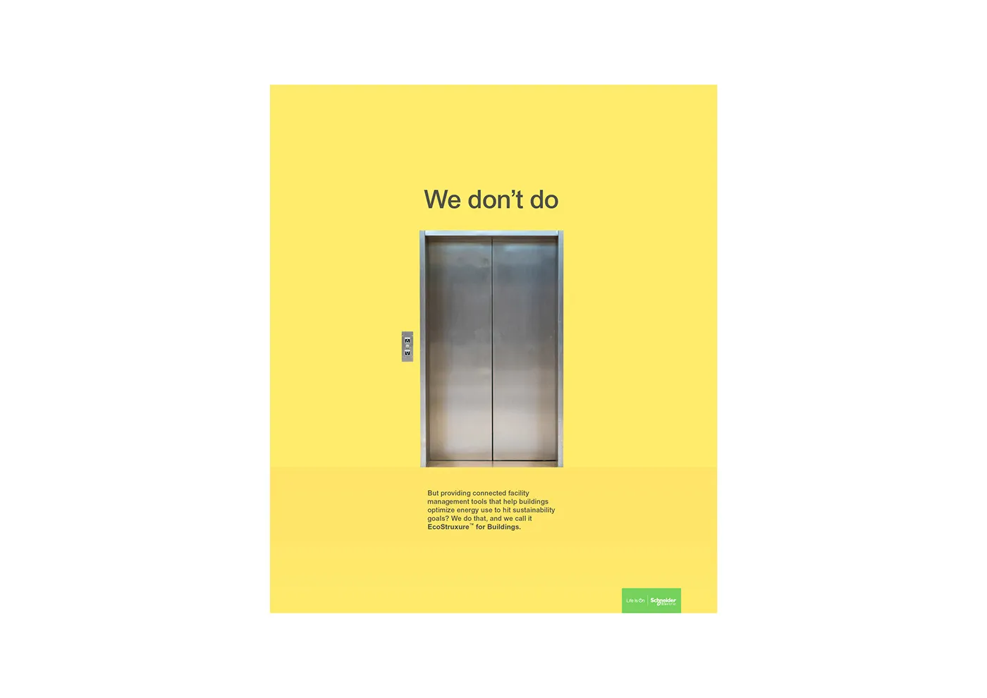
Schneider’s problem in advertising is that the product is infrastructure. It sits behind a wall, and explaining it takes a paragraph most people won’t read.

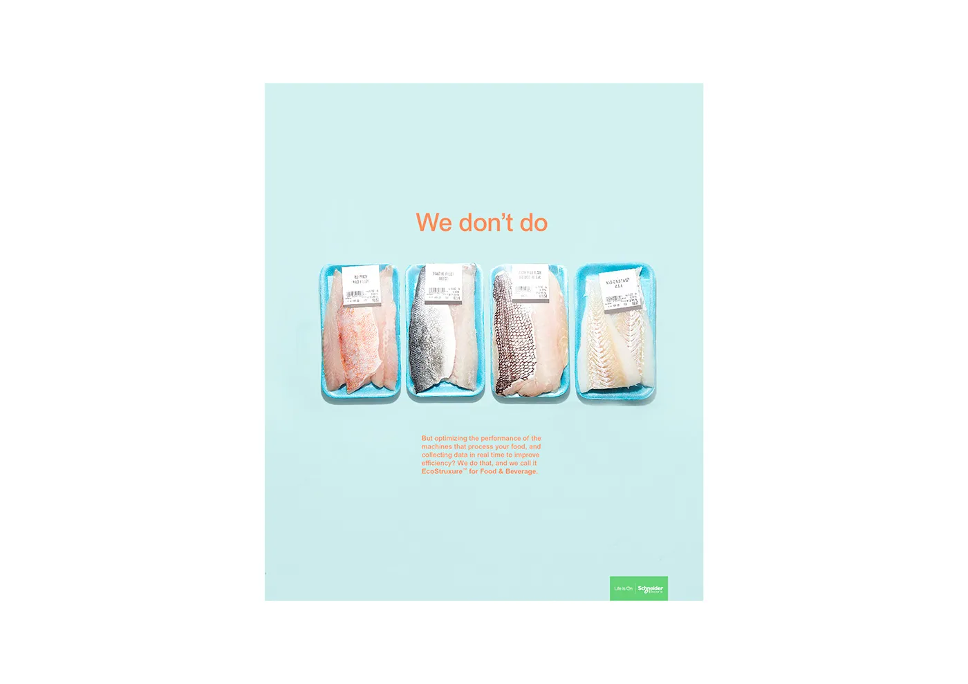
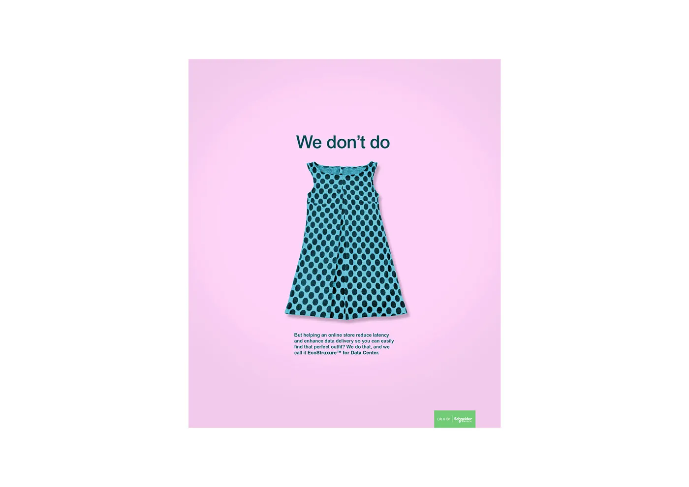
So these posters don’t explain. Each one opens with something you recognize instantly, an elevator, a supermarket tray of fish, a cheap polka-dot dress, and says we don’t do that. The copy then gets to what we do instead: the connected facility management that helps that building hit its energy targets, which we call EcoStruxure.

The structure does two jobs at once. It gets a familiar, slightly funny image onto the page for a company that otherwise photographs grey cabinets. And it puts the reader half a step ahead of the copy, since working out what we do by elimination is more engaging than being told outright.

Picking the three subjects was the real work. Each one had to be something Schneider obviously doesn’t make, but close enough to the actual product that the turn lands instead of coming off as a non sequitur. An elevator is in the building. The fish went through a processing plant. The dress came from a store running on a data center. The rule was one step of separation, never two.

The concept and the design were mine, and I worked with writers to get the copy down. The photography is stock, and the campaign wasn’t selected in the end.

Small but Mighty

2021 · employer · Schneider Electric

Illustrator · Photoshop

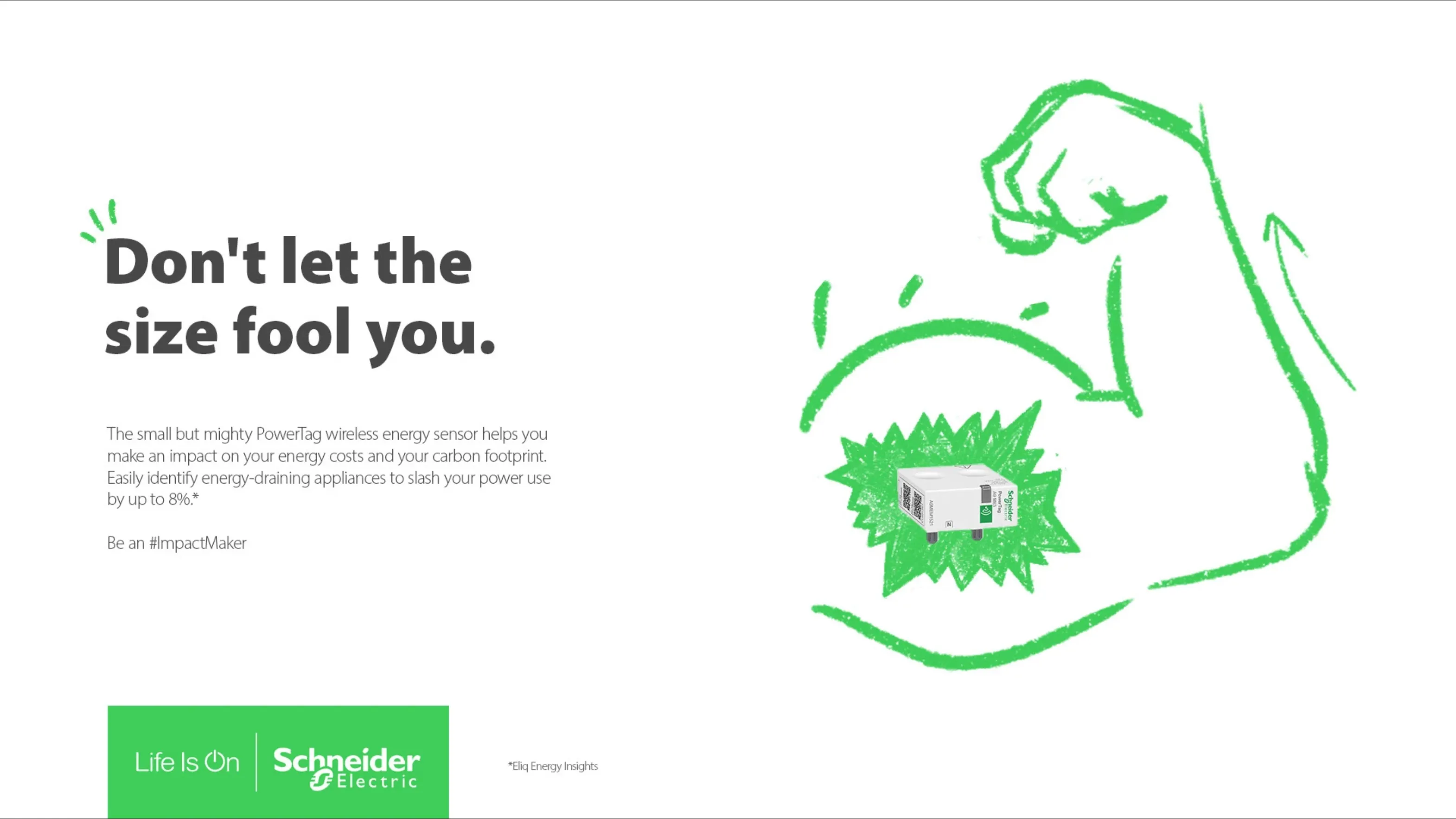
The PowerTag is a small white plastic box. It’s a clever product, a wireless sensor that clips into your electrical panel and tells you which appliance is eating your bill, but photographed honestly it looks like nothing at all.

So the drawing does the job the product shot can’t. I drew all of it by hand in green marker and dropped the product into the middle.

What the illustration really carries is scale and consequence: 8% off your power use, 90% faster to install, 30% smaller footprint, a meter needle falling, a house, a plug, sparks. None of that shows up in a photo of a white box, but all of it reads fine as a scribble.

The two treatments were separate explorations. One is a dense field that fills the frame and rewards a longer look. The other is a single gag, , that works from across the room.

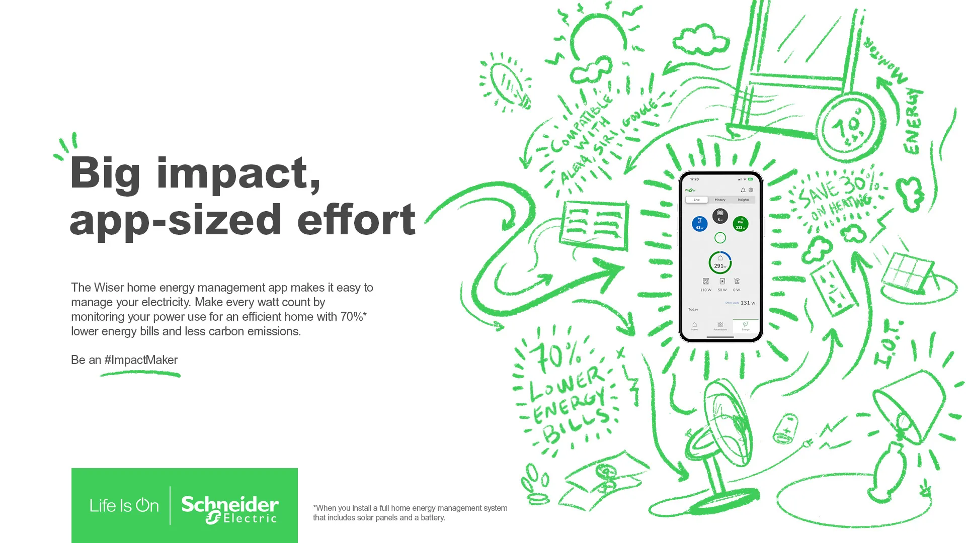
Then the same hand went across two more products for two more audiences. The Wiser app was the easier one, since a phone screen already gives you something to look at, and the drawing just has to build a world around it.

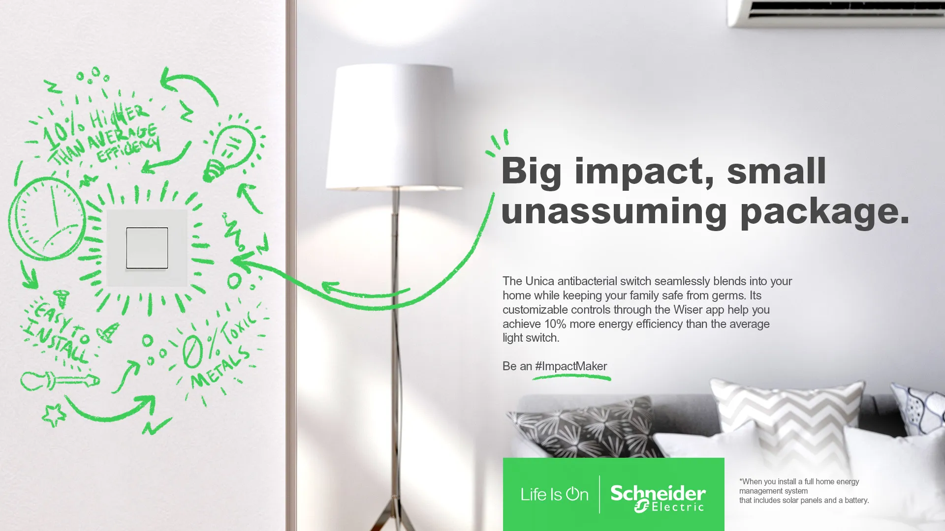
The switch changed what the illustration was doing. Instead of drawing on white, I drew onto a photograph of a room, like somebody had marked up the wall around the switch. At that point the drawing stops being a background and becomes an annotation.

ROUSH Active Exhaust

2015 · employer · ROUSH Performance

WordPress · Photoshop

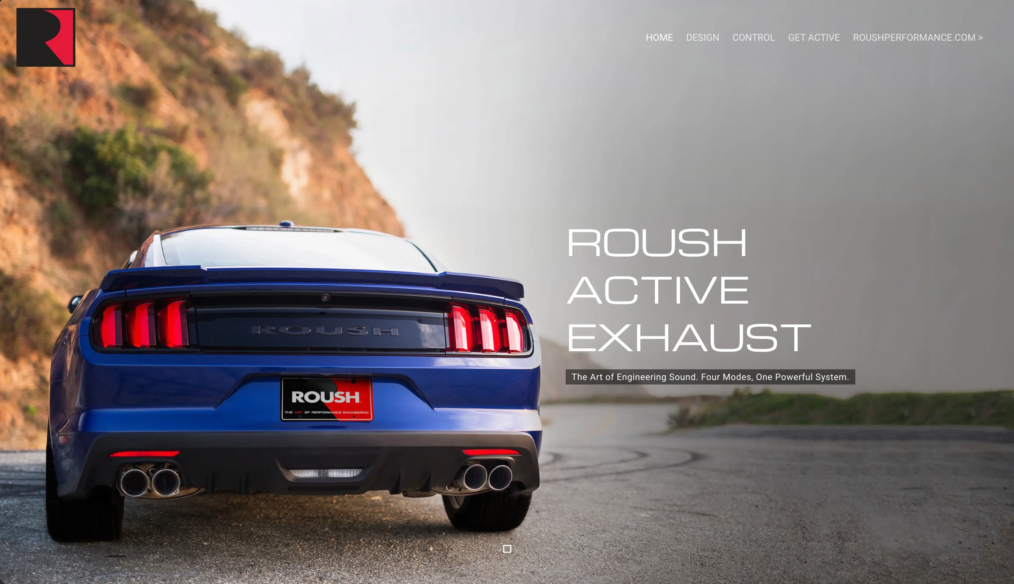
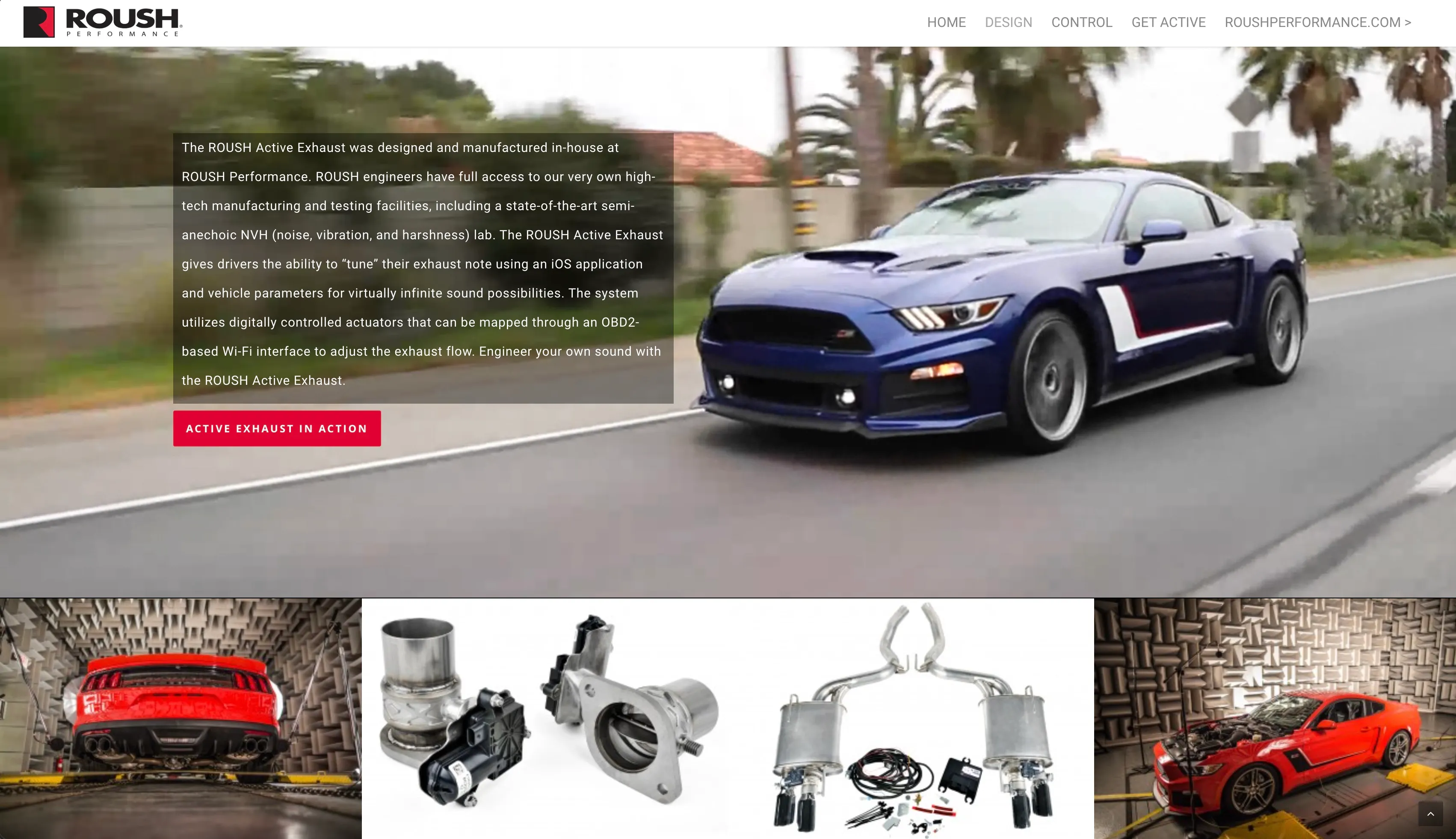
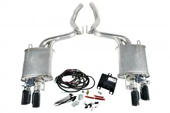
In 2015 I was tasked with creating a landing page for the launch of ROUSH Performance’s new active exhaust system. Offered as a feature on ROUSH Mustangs, the active exhaust system allowed drivers to control the sound and flow of their exhaust system.
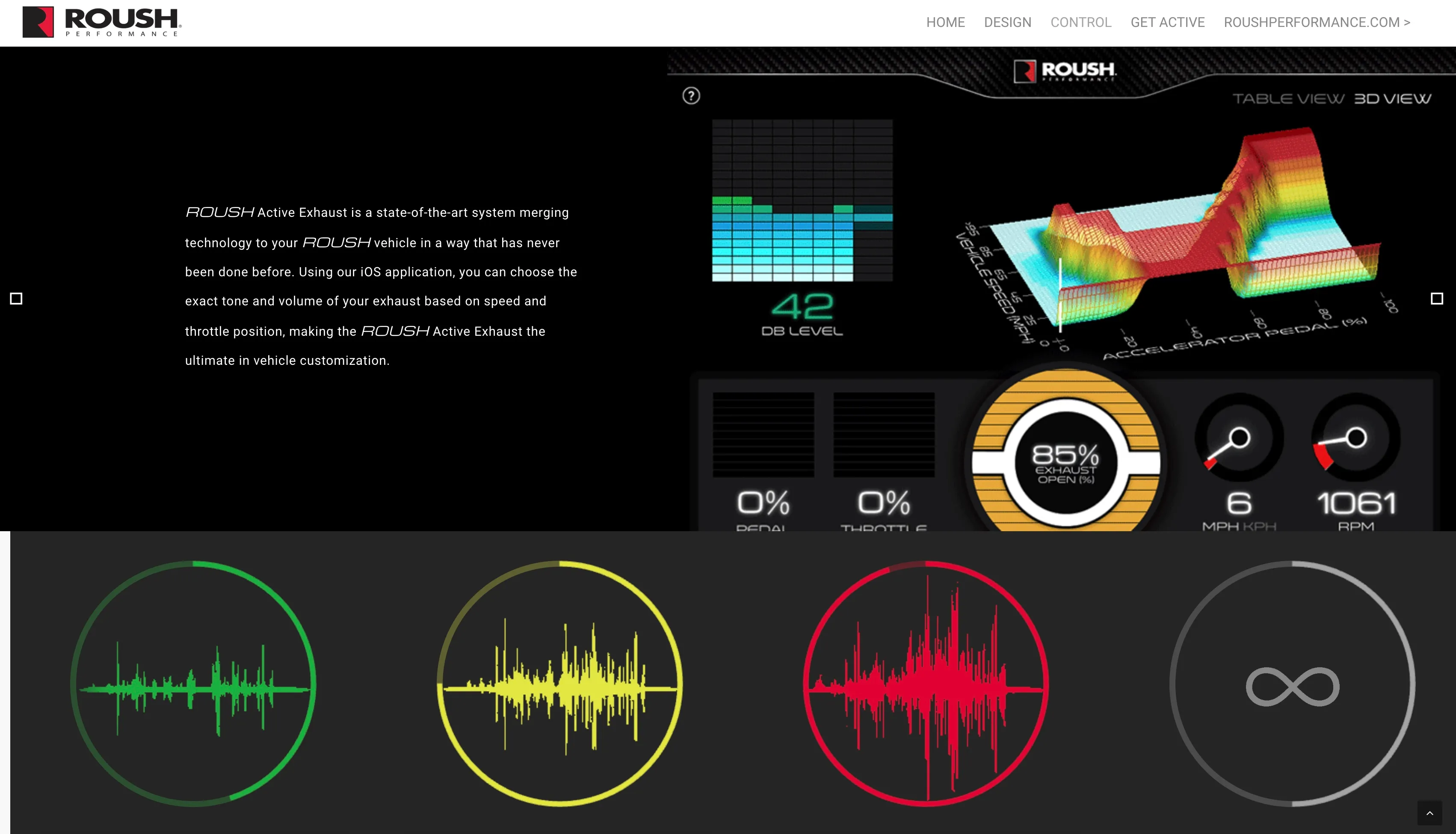
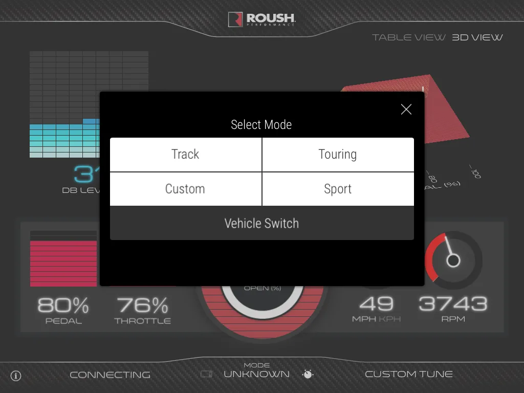
There are four modes — Touring, Sport, Track, and Custom all controlled via mobile app.

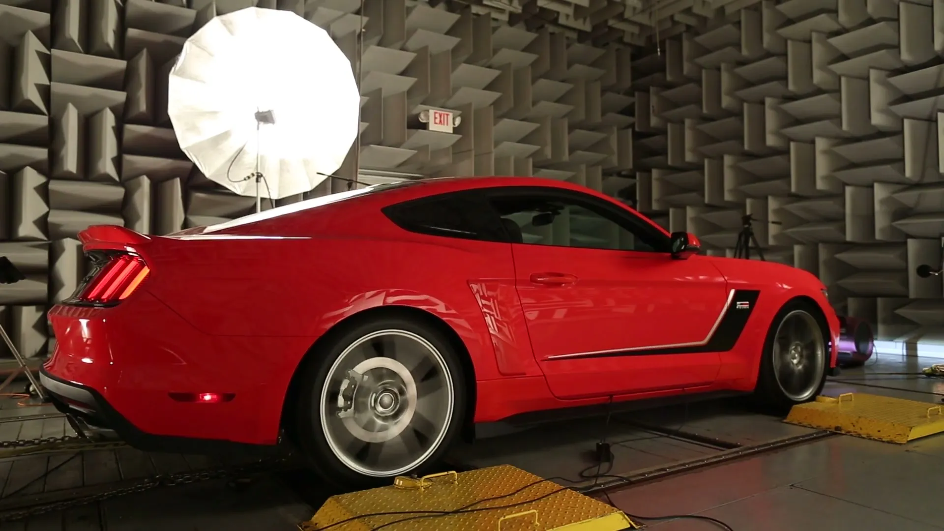
The primary selling point for any exhaust is the sound, so that needed to be featured on the landing page. First through video, , then in a section that lets the user play examples of each mode’s exhaust note.

The modes section required some tricky repurposing of existing WordPress plugins. I had to make some modifications to the code to allow for the unique media and to get a 3 column layout that fit the site in a visually cohesive way.

The recordings came out of ROUSH’s own NVH lab, which is a semi-anechoic chamber with a rolling road in the floor. So that audio was a perfect example of the real results a prospective installer or owner would get.

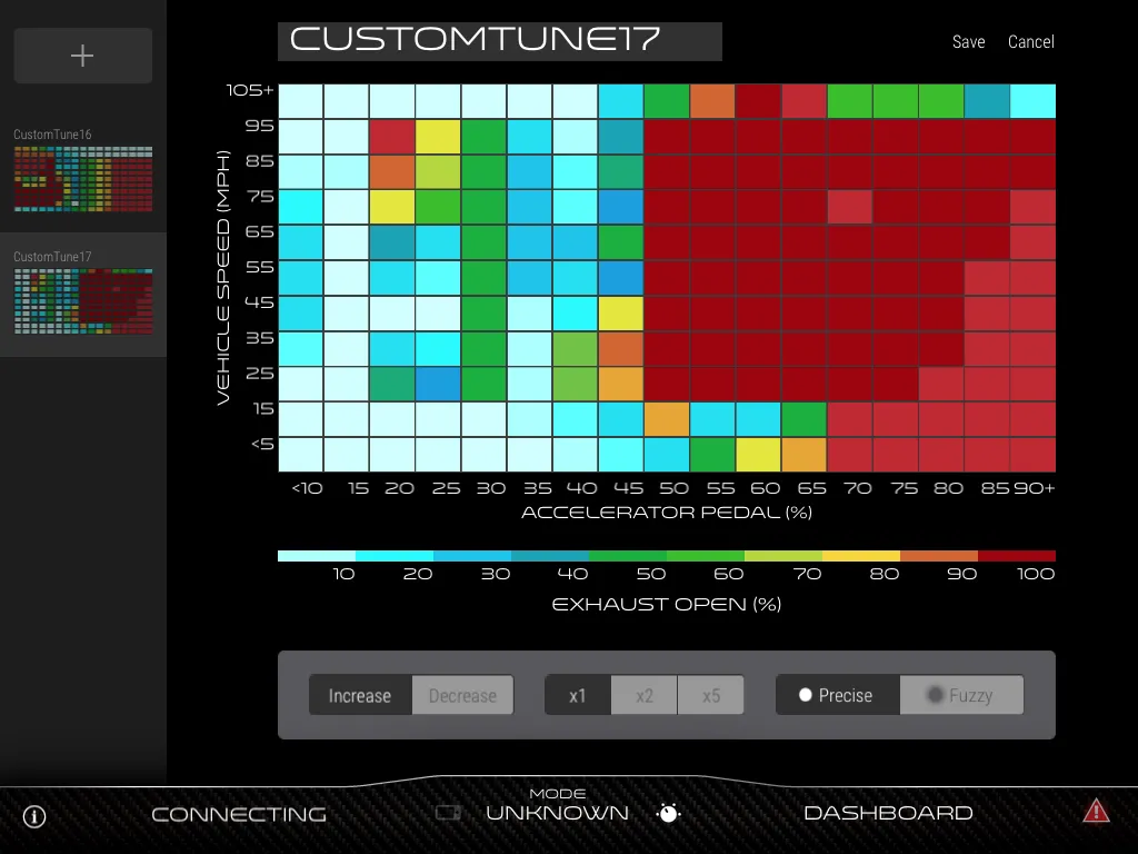
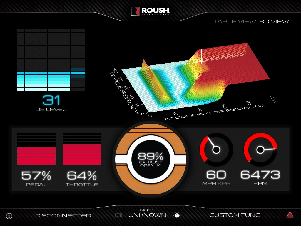
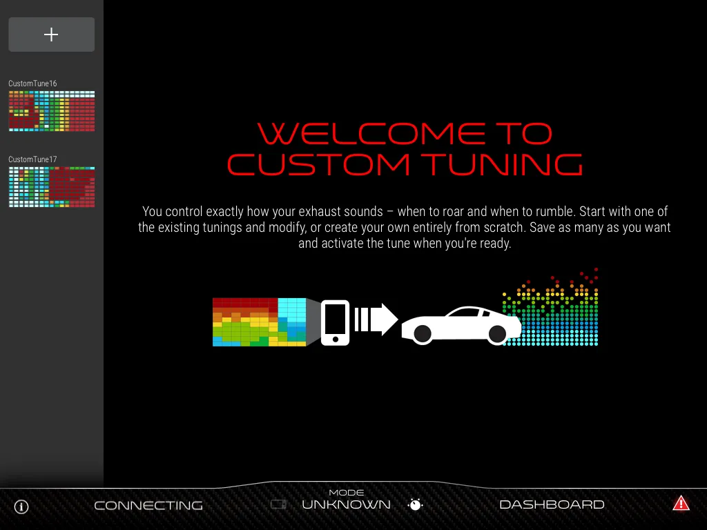
The app, which allowed the user to map the exhaust note to throttle position was a novel idea at the time. These active systems were fairly uncommon among manufacturers and the ability to install one from the aftermarket really set ROUSH apart from competitors in the market.

The rest of the app is a dashboard with live telemetry off the OBDII feed and a mode switcher. Showing these features in an instantly parseable way was paramount to the success of the landing page.

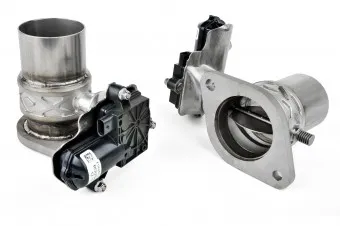
The hardware itself was simple. Valves controlled by servos. But the way it connected to the vehicle through OBD made this system wholly unique.

The site is no longer active, 2015 was a long time ago. But you can still see it in some form using the wayback machine, though not without some bugs.

activeexhaust.roushperformance.com


Résumé

Experience

  1. Senior Designer

    Schneider Electric, Foxborough, MA | June 2017 - Current

    • Art direction for studio and editorial photography on customer feature campaigns.
    • End-to-end print production for digital, large-format, and OOH assets: vendor coordination and press-ready files across CMYK and RGB workflows.
    • Adapted brand assets across formats, from executive presentations to large-scale environmental graphics.
    • Concepted and pitched campaigns to executive stakeholders.
    • Designed events, activations, and environmental graphics, from concept through installation.
    • Designed executive presentations that make dense technical content readable.
  2. Graphic/Web Designer

    RI Mushroom Co., West Kingston, RI | June 2020 - June 2021

    • Designed and built the company website.
    • Created social and digital assets: graphics, video, and campaigns.
    • Designed product packaging.
  3. Graphic/Web Designer

    True Engineering Technology, Lincoln, MA | February 2016 - July 2017

    • Led a full rebrand: logo and visual identity.
    • Designed and built websites.
    • Produced content across web, print, and social.
  4. Web Content Specialist

    Roush Enterprises, Plymouth, MI | November 2014 - February 2016

    • Managed content and e-commerce for ROUSH Performance, SLP, and affiliated websites.
    • Built micro-sites and e-commerce pages.
    • Designed assets for social media and blogs.

Education

Academy of Art University, San Francisco, CA | 2009 - 2013

Bachelor of Fine Arts, Web Design & New Media.

Skills & Interests

Technical Skills
Adobe Creative Suite (Photoshop, Illustrator, InDesign, After Effects), Figma, Fusion 360, Press-ready File preparation, Large format & OOH production, Photography, Illustration, Layout, Parametric modeling, Logo design.
Personal Interests
Industrial design, Product design, Prototyping, Photography, Art, Architecture, Engineering, Billiards, Motorsport.